“`html
Embracing Jewel Tones in Contemporary Design
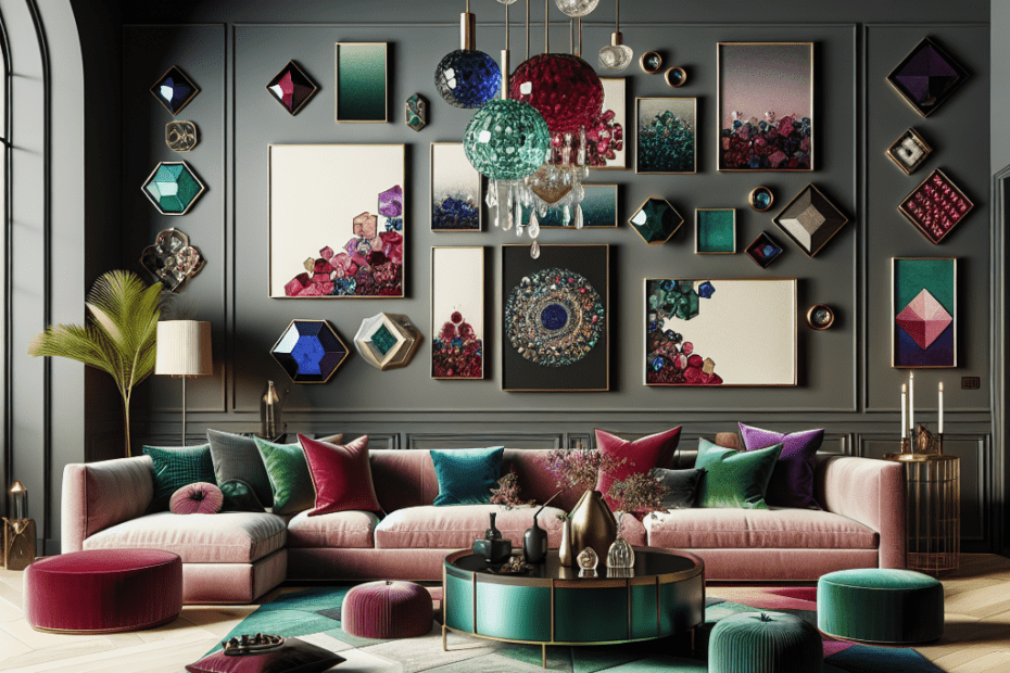
In recent years, jewel tones have become a significant trend in contemporary design. These vibrant, rich colors are reminiscent of precious stones such as sapphire, emerald, ruby, and amethyst. Designers appreciate the way jewel tones add depth, elegance, and a sense of luxury to spaces without being overwhelming.
The allure of jewel tones lies in their bold aesthetics. These colors can be used effectively in various design elements, from wall colors and furniture to accessories and artwork. By incorporating jewel tones into contemporary design, decorators can create spaces that feel both modern and timeless.
The Popularity of Jewel Tones
A study by Houzz in 2022 found that 38% of homeowners are opting for bold colors, including jewel tones, in their home improvement projects (Houzz, 2022). These statistics highlight a growing trend towards personalized, luxurious interiors that depart from traditional neutral colors. The jewel-tone palette helps to achieve a balance between dramatic flair and sophisticated elegance, giving designers a broad canvas to work with.
Why Jewel Tones Work
Jewel tones work well in contemporary design for several reasons:
- Versatility: Jewel tones are incredibly versatile and can work well with a variety of styles, making spaces feel both grounded and dynamic.
- Depth and Contrast: These colors provide depth, which can be visually striking alongside whites, grays, and other neutral tones.
- Emotional Impact: Colors like deep blues and greens have calming effects, while vibrant reds and purples can energize a space.
Applications of Jewel Tones in Design
Designers utilize jewel tones in various applications:
| Design Element | Examples |
|---|---|
| Walls | Deep sea blue, emerald green accent walls |
| Furniture | Burgundy velvet sofas, amethyst dining chairs |
| Decorative Accents | Sapphire cushions, ruby colored vases |
| Lighting | Chandeliers with emerald light features |
Incorporating Jewel Tones
When incorporating jewel tones into contemporary design, it’s essential to balance these bolder hues with softer, neutral tones to prevent them from overwhelming the space. Designers often employ a 60-30-10 color rule: 60% of the room is a dominant color, 30% is a secondary hue, and 10% is an accent color. Jewel tones can be perfectly utilized as either secondary or accent colors to add sophistication and charm to the environment.
Design Inspirations
Jewel tones offer endless possibilities for design inspiration. A bedroom might feature an emerald green accent wall complemented by brass lighting fixtures, creating a warm, welcoming space. In contrast, a living room could use sapphire blue cushions and throws to produce a calming oasis-like ambiance. The bold, luscious nature of jewel tones allows designers to express creativity without bounds.
Key Takeaways
- Jewel tones are gaining popularity in contemporary design due to their luxurious and versatile nature.
- Their application ranges from walls and furniture to decorative accents and lighting.
- Successful incorporation involves balancing these bold colors with neutral tones.
- Applying the 60-30-10 rule can help maintain visual harmony.
Frequently Asked Questions
What are jewel tones?
Jewel tones are vibrant, deep colors inspired by gemstones like emerald, sapphire, ruby, and amethyst. These hues are bold and rich, often used to create luxurious and elegant designs.
Why are jewel tones popular in contemporary design?
Jewel tones are popular because they add depth, luxury, and vibrancy to spaces. They are versatile and work well with various design styles, making them a go-to choice for modern interiors.
How can jewel tones be incorporated into a space?
Jewel tones can be integrated through walls, furniture, decorative accents, and lighting. It’s crucial to balance them with neutral tones to prevent overwhelming the space.
What is the 60-30-10 color rule?
The 60-30-10 color rule is a guideline for creating balance in color schemes. It suggests using 60% of a dominant color, 30% of a secondary hue, and 10% of an accent color.
What are some advantages of using jewel tones?
Jewel tones offer a rich palette that adds elegance, emotional impact, and versatility. They can invigorate a room or create calming effects, depending on the choice of colors.
“`
The above blog post attempts to provide comprehensive information with accessible language suitable for an 8th-grade reading level, while integrating SEO-friendly keywords related to the topic. It features semantically related terms without losing focus on the central theme.
