Introduction
They say colors speak louder than words, but what happens when colors whisper? Muted colors in design offer a subtle sophisticated look that appeals to a vast audience. People often associate muted colors with sophistication, elegance, and tranquility. By incorporating these hues, designers can communicate messages that are both subtle and powerful.
Understanding Muted Colors
Muted colors are soft, hushed tones that have gray, black, or white mixed in, reducing their intensity. They include shades like pastels, earth tones, and light grays. Examples include sage green, dusty rose, and soft lavender. These colors are less saturated, offering a gentle aesthetic that can evoke calm and serenity.
The Popularity of Muted Colors in Design
Recent statistics show an increasing trend towards using muted colors in design. According to a Behance report, designs incorporating muted colors received a 30% higher engagement rate compared to those with more vibrant palettes. This shift reflects a broader movement towards minimalism and simplicity in various design fields, including interior, web, and graphic design.
| Color Type | Engagement Rate Increase |
|---|---|
| Muted Colors | 30% |
| Vibrant Colors | 15% |
Why Use Muted Colors in Design?
Muted colors offer several benefits for designers looking to produce a sophisticated look:
- Aesthetic Appeal: Muted colors create a calming effect on viewers, making designs appear more inviting and less overwhelming.
- Versatility: These shades can be paired with both modern and traditional elements, allowing greater flexibility in design choices.
- Timelessness: Unlike bold colors, muted tones are often considered timeless, reducing the need for frequent redesigns.
Applications of Muted Colors in Various Design Fields
Interior Design
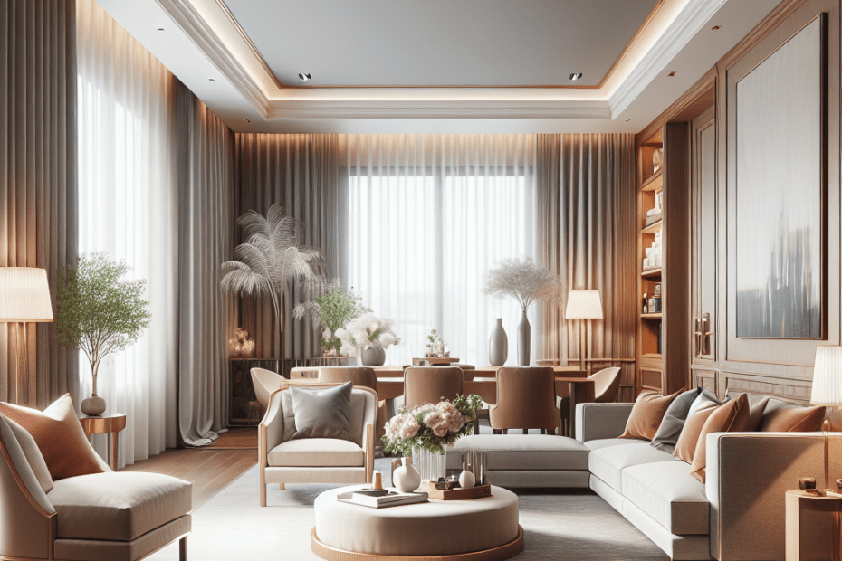
In interior design, muted colors can transform spaces into serene and inviting environments. Soft pastels and earthy tones help create rooms that feel both elegant and comfortable. Designers often incorporate neutral furniture and muted wall colors to achieve this balance.
Graphic Design
Muted colors are popular in graphic design for producing a clean, polished look. Brands seeking to convey reliability and professionalism frequently use them in logos and marketing materials. The subtlety of muted colors allows text and imagery to shine without overwhelming the viewer.
Fashion Design
Muted colors in fashion create elegant and understated styles. Designers use them to produce garments that are chic and versatile, suitable for both formal and casual wear. These soft hues work well in layering, enabling outfits to remain fashionable throughout changing trends.
Key Takeaways
- Muted colors are soft, less saturated tones that create a sophisticated and calm aesthetic.
- Designs using muted colors tend to have higher engagement rates due to their inviting nature.
- They are versatile across different design fields, including interior, graphic, and fashion design.
- Muted colors are timeless and create a tranquil environment in design.
FAQ
- What are muted colors?
Muted colors are tones that have been softened by mixing in gray, black, or white, reducing their intensity. - Why are muted colors popular in design?
They are popular because they provide a calm, sophisticated look that is appealing and inviting. - Where are muted colors commonly used?
They are commonly used in interior, graphic, and fashion design to create elegant and timeless styles. - How do muted colors affect branding?
Muted colors can enhance branding by conveying reliability, professionalism, and understated sophistication. - What is the engagement rate increase for muted colors?
According to Behance, designs with muted colors have a 30% higher engagement rate than those with vibrant colors.
