“`html
The Essentials of Neutral Color Schemes in Minimalist Homes
Neutral colors in minimalist design have become a hallmark of contemporary interior aesthetics. They have a unique ability to create spaces that feel both tranquil and sophisticated. This blog post explores the essentials of neutral color schemes in minimalist homes, emphasizing their benefits, how to effectively use them, and the statistics supporting their growing popularity.
Understanding Neutral Colors
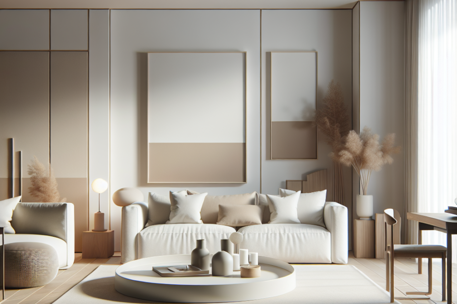
Neutral colors primarily include whites, beiges, grays, and analogous shades that form a calming backdrop in interior spaces. These colors are perfect for minimalistic homes where simplicity reigns supreme. In essence, neutrals are the unsung heroes in design, providing an adaptable base that allows other elements to shine.
In minimalist design, neutral colors serve several purposes:
– They create a soothing and balanced environment.
– They make spaces feel larger and more open.
– They provide flexibility, allowing for easy incorporation of vibrant accents or textures.
The Popularity of Neutral Color Schemes
According to a 2022 survey by the American Society of Interior Designers, 60% of interior designers believe that neutral colors will dominate home design trends for the foreseeable future. This preference is not without merit. Neutral schemes are celebrated for their versatility and timeless appeal.
Moreover, a 2021 study published in the Journal of Environmental Psychology found that spaces decorated with neutral color palettes enhance occupants’ cognitive performance and well-being, as they tend to be less visually fatiguing.
How to Incorporate Neutral Colors in Minimalist Design
1. **Choose Your Base**: Start with a base color that sets the tone for your space. Whites and grays are particularly effective in minimalist settings due to their clean, crisp quality.
2. **Layer Different Shades**: Use various shades of neutral colors to add depth and dimension. For instance, mixing soft beiges with deeper taupe can create an engaging visual interplay.
3. **Add Texture**: Introduce textures like wood, linen, or wool to prevent spaces from feeling sterile. Texture can add warmth and interest without deviating from the neutral theme.
4. **Accents with Purpose**: While the main color palette remains neutral, introduce subtle accents through artwork, greenery, or small decorative elements to provide focus points.
5. **Lighting Matters**: Ensure your lighting complements your color scheme. Soft, warm lighting can enhance the subtle hues of neutrals, making the space feel cozy and inviting.
Advantages of Neutral Colors in Minimalist Design
Neutral color schemes offer several advantages, particularly for minimalist interiors:
– **Calm and Peaceful Ambience**: Neutrals create a serene backdrop that enhances comfort and relaxation.
– **Unified Aesthetic**: They ensure cohesion and flow throughout a home, making transitions from room to room seamless.
– **Easy to Update**: With a neutral base, updating your décor with new trends or seasonal items becomes hassle-free.
– **Highlighting Architecture**: They allow architectural features and furniture design to take center stage without visual competition.
Challenges and Considerations
While neutral colors in minimalist design have many advantages, they are not without challenges. Achieving a balance between simplicity and starkness requires careful planning. Spaces can sometimes feel too cold or sterile if mismanaged. Thus, applying the right textures, patterns, and lighting is crucial to create a welcoming environment.
Key Takeaways
– Neutral colors in minimalist design, such as whites, grays, and beiges, provide a calming, elegant backdrop that enhances the perception of space.
– These colors are increasingly popular, with 60% of designers favoring them for their versatility and timeless appeal.
– Incorporating different shades, textures, and purposeful accents can help maintain interest and prevent neutrality from becoming monotonous.
– Careful planning is necessary to keep the aesthetic from becoming too stark or cold.
| Year | Statistic | Source |
|---|---|---|
| 2022 | 60% of designers favor neutral color schemes | American Society of Interior Designers |
| 2021 | Neutral spaces enhance cognitive performance | Journal of Environmental Psychology |
FAQs
- Why are neutral colors popular in minimalist design?
Neutral colors are popular in minimalist design because they create a calming atmosphere, offer versatility, and allow for easy modification with accents or textures. - How can I add interest to a neutral color scheme?
Interest can be added through textures, such as wood or linen, and subtle accents like artwork or plants. - Can neutral colors make a room look bigger?
Yes, neutral colors can make spaces appear larger and more open due to their reflective properties and ability to create visual harmony. - What is the main benefit of using a neutral color palette?
The main benefit is their ability to provide a timeless, versatile backdrop that can be easily updated with decor changes. - Are there any downsides to using neutral colors?
The primary downside is the risk of the space feeling too cold or sterile, which can be mitigated by incorporating textures and warm lighting.
“`
This post provides a comprehensive guide to understanding and utilizing neutral color schemes in minimalist homes, appealing to both seasoned interior designers and those new to the concept.