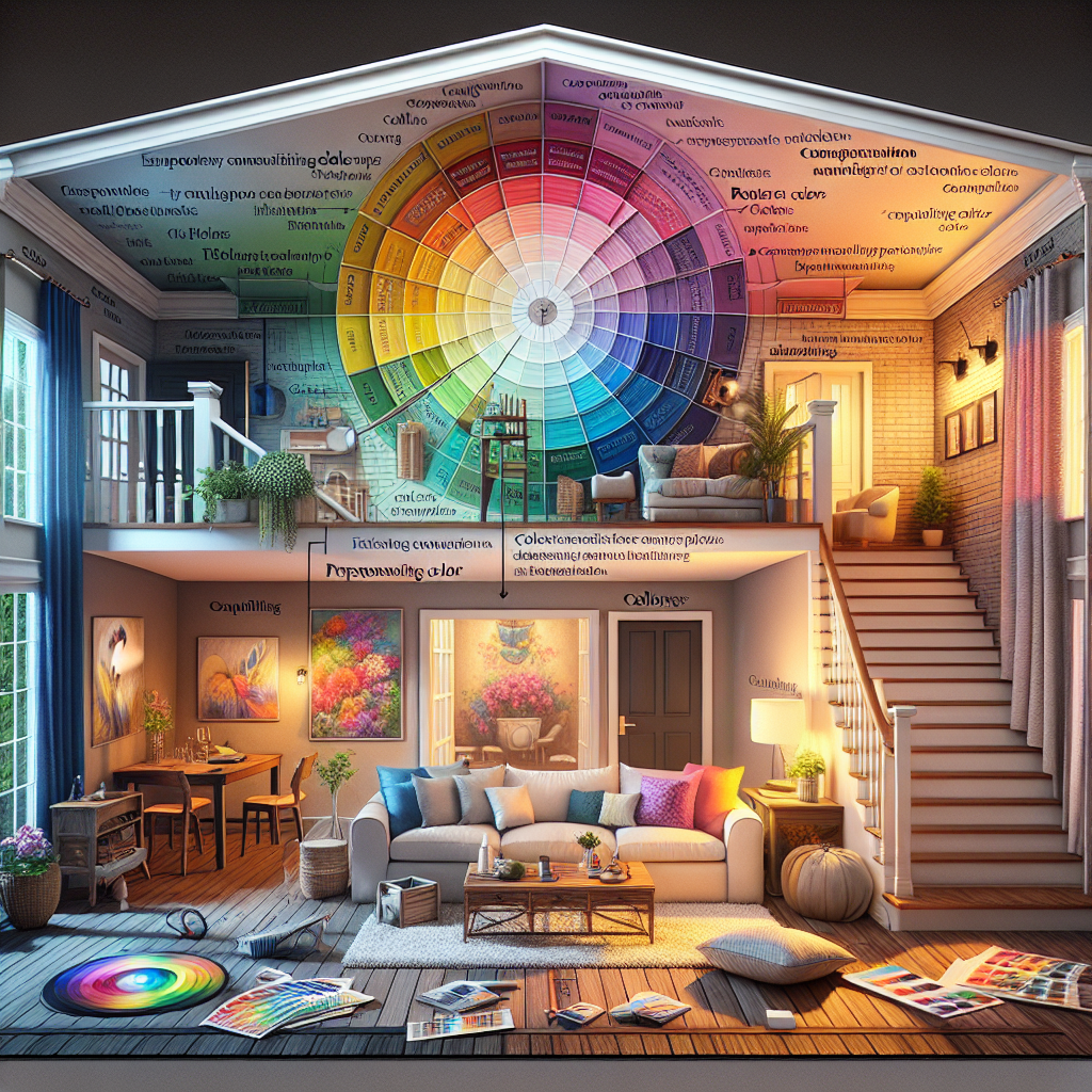
Understanding Color Theory Basics in Home Design
What is Color Theory?
Color theory is a set of guidelines used to mix, match, and contrast colors to produce visually appealing combinations. These principles are key in various fields such as art, design, and fashion, and are especially important in home design. By understanding color theory, they can make informed choices that contribute to the overall aesthetics and mood of their home.
Primary, Secondary, and Tertiary Colors
The color wheel, created by Sir Isaac Newton in 1666, is the foundation of color theory. It consists of:
- Primary Colors: Red, blue, and yellow. These are pure colors and cannot be created by mixing other colors.
- Secondary Colors: Green, orange, and purple. These are created by mixing two primary colors.
- Tertiary Colors: These colors are made by mixing a primary color with a secondary color. For example, red-orange or blue-green.
Color Schemes in Home Design
They can choose from several different color schemes in home design:
Monochromatic
This color scheme uses various shades, tints, and tones of a single color. For example, a room decorated with light blue, medium blue, and dark blue can be very calming and cohesive.
Analogous
Analogous color schemes use colors that are next to each other on the color wheel, such as blue, blue-green, and green. These schemes are often found in nature and are very pleasing to the eye.
Complementary
This involves colors that are opposite each other on the color wheel, like red and green or blue and orange. Complementary schemes create high contrast and can make a room feel energetic and dynamic.
Triadic
Triadic color schemes use three colors that are evenly spaced around the color wheel, producing a balanced and vibrant look. Examples include red, blue, and yellow or green, purple, and orange.
The Psychology of Color
Color psychology is another essential aspect of understanding color theory basics. Different colors can evoke different feelings and moods:
- Red: Can stimulate energy and passion but might also evoke feelings of anger or stress if overused.
- Blue: Often associated with calmness and serenity. It’s a popular choice for bedrooms and bathrooms.
- Green: Represents nature and tranquility, promoting relaxation and balance.
- Yellow: Brings warmth and cheerfulness but should be used sparingly as it can be overpowering.
- Purple: Associated with luxury and creativity. It can add a touch of sophistication to any room.
Statistics on Color Preferences in Home Design
According to a survey conducted by Behr, a prominent paint company, 62% of homeowners believe that the color of their walls can significantly affect their mood (Source: Behr.com). Additionally, 31% of respondents feel that blue is the most relaxing color for home interiors, while 29% consider green as the most peaceful.
Popular Colors in Home Design (2023)
| Color | Percentage |
|---|---|
| Blue | 31% |
| Green | 29% |
| Gray | 18% |
| White | 15% |
| Yellow | 7% |
Practical Tips for Applying Color Theory
Here are some practical tips that can help when applying color theory basics to home design:
- Start with a Neutral Base: Using neutral colors for walls and larger pieces of furniture provides a flexible base that can be jazzed up with colorful accessories.
- Use the 60-30-10 Rule: This rule is about creating balance. Use one color for 60% of the room, a second color for 30%, and a final accent color for 10%.
- Consider Lighting: The appearance of colors can change depending on the lighting in the room. Test paint samples in different lighting conditions before making a final choice.
- Don’t Be Afraid to Experiment: Sometimes stepping out of their comfort zone and trying bold, unexpected colors can result in a stunning design.
Key Takeaways
- Color theory basics are essential for creating harmonious and aesthetically pleasing home designs.
- The color wheel consists of primary, secondary, and tertiary colors.
- Different color schemes like monochromatic, analogous, complementary, and triadic can guide their choices.
- Understanding color psychology can help set the desired mood for each room.
- Practical tips include starting with a neutral base, using the 60-30-10 rule, and considering lighting.
FAQ
- What are the primary colors?
- The primary colors are red, blue, and yellow.
- What is a monochromatic color scheme?
- A monochromatic color scheme uses various shades, tints, and tones of a single color.
- How do complementary colors affect a room’s atmosphere?
- Complementary colors, being opposite on the color wheel, create high contrast and make a room feel energetic and dynamic.
- Which color is often considered the most relaxing for home interiors?
- According to a survey, 31% of respondents believe blue is the most relaxing color for home interiors.
- How does lighting affect the appearance of colors?
- The appearance of colors can change based on the lighting conditions in the room, so it is crucial to test paint samples in different lighting.
