“`html
When they step into a room and feel an instant sense of harmony, it is likely due to effective interior design principles at play. One such principle is the 70-20-10 Color Rule, a timeless guideline used by designers to create balanced and visually appealing spaces. This rule simplifies the process of combining colors in a room and ensures that everything looks cohesive.
What is the 70-20-10 Color Rule?
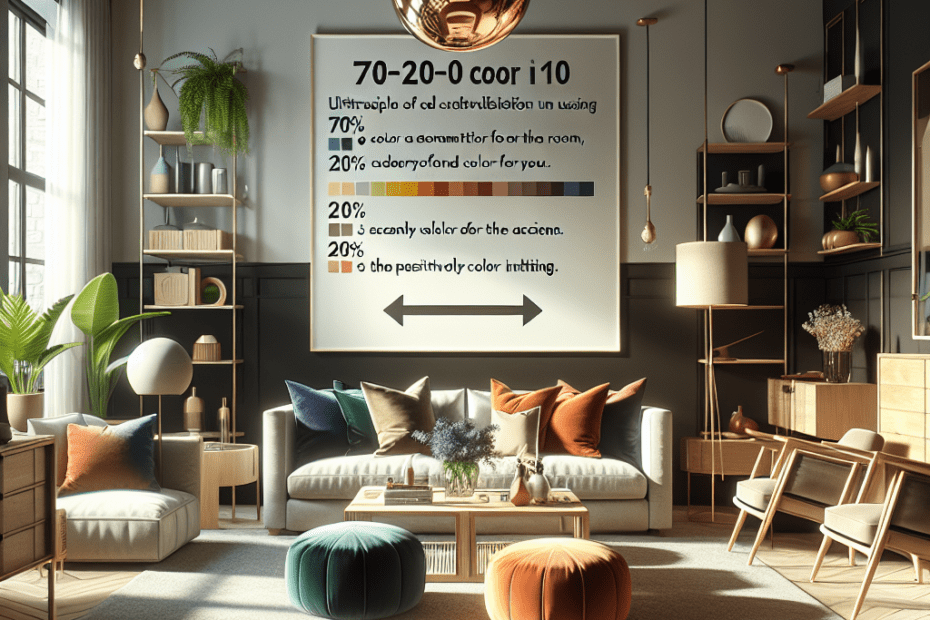
The 70-20-10 Color Rule is a method used in interior design to ensure that spaces have the right balance of color. This rule suggests that three colors should dominate the color palette in any given room:
- 70% – This is the primary color and covers most of the room, including walls, large areas of flooring, or big-sized furniture pieces.
- 20% – This is the secondary color and is typically used for furniture items, like coffee tables and bookshelves, or even in smaller decor elements.
- 10% – This is the accent color, providing visual interest and creating a pop of contrast. Accents could be pillows, artwork, or vases.
For example, in a room where the walls and the carpet make up the 70% in a neutral grey, a deep blue could be 20% on the sofas, and a vibrant yellow could serve as the 10% in the form of decorative cushions. This strategic use of color ensures that no single color overpowers the space.
Why Use the 70-20-10 Color Rule?
There are several reasons why the 70-20-10 Color Rule is popular among interior designers:
1. Achieves Balance and Harmony
By dividing colors in a 70-20-10 ratio, they create a well-balanced room. The proportions prevent too many competing colors from clashing. According to a study published in the Journal of Interior Design, rooms using balanced color schemes are more likely to be perceived as harmonious by 85% of the populace.
2. Simplifies the Design Process
This rule simplifies the decision-making process, cutting down hours spent debating color combinations. It offers a straightforward formula that both novice decorators and seasoned designers can follow easily.
3. Adds Visual Interest with Minimal Effort
By limiting the use of an accent color to 10%, they can add a pop of interest without overwhelming the room. This allows them to experiment with bolder, trendier colors in smaller doses, thus reducing the risk of buyer’s remorse.
Implementing the 70-20-10 Color Rule
When adopting this rule, it’s important to choose colors that complement each other. Here’s how to effectively apply the 70-20-10 color scheme:
1. Choose a Base Color
This is the 70% of their room’s color. It should be versatile and foundational, such as shades of beige, grey, or white. Neutral colors often work best here as they serve as a backdrop for other elements.
2. Pick a Secondary Color
Make this the 20% of the room. This color should offer some contrast to the primary color while still being complementary. Popular choices include shades of blue, green, or earth tones, which can be calming or invigorating depending on their shade.
3. Select an Accent Color
The final 10% is where their creativity can shine. This is the place for daring hues and trendy colors. Accent colors are the easiest to change, so they can adjust them as their tastes evolve.
| Color | Usage |
|---|---|
| 70% Base | Walls, rugs, large furniture |
| 20% Secondary | Smaller furniture, curtains, secondary details |
| 10% Accent | Pillows, art, decorative objects |
Case Studies using 70-20-10
From modern to contemporary designs, the 70-20-10 Color Rule applies across various styles. For instance, a minimalist living room might use a white (70%), black (20%), and red (10%) palette to emphasize simplicity while keeping a touch of excitement. A Scandinavian-style room could feature muted earth tones (70%), an olive green sofa (20%), and mustard yellow items (10%).
Key Takeaways
- The 70-20-10 Color Rule provides a tried-and-true formula for achieving color balance in any room.
- This design principle helps structure the color layout, creating harmony and ease of visual perception.
- Selecting complementary colors within this ratio makes the design process fuss-free and adaptable.
- They can implement this rule in numerous styles, ensuring timeless and trendy decor.
FAQ
Q1: Can they use more than three colors with the 70-20-10 rule?
A1: While the rule traditionally uses three main colors, they can incorporate additional hues through patterns or textures as long as these don’t detract from the main color balance.
Q2: What if they don’t want to use a neutral color as the base?
A2: They can definitely use a non-neutral color as the base, but it should be something they’re comfortable seeing in large doses since it will dominate the room.
Q3: How can they change the room’s look without repainting?
A3: To update a room without repainting, they can easily switch out the secondary or accent colors through accessories like cushions, throws, and art.
Q4: Is the 70-20-10 rule suitable for open floor plans?
A4: Yes, it can be adapted to open floor plans by extending the primary color across connected spaces for cohesion while using secondary and accent colors to define specific areas.
Q5: Can this rule apply to other forms of design besides interior spaces?
A5: Absolutely! The 70-20-10 rule can be applied to web design, fashion, and more, wherever a curated and balanced color scheme is desired.
“`
