Understanding the Importance of Negative Space in Design
In the world of design, negative space often carries more significance than many people realize. When they talk about negative space in design, they refer to the blank areas around and between the main elements of an image or layout. It might seem odd to focus on what’s not there, but designers know that this space is just as important as the components they’re emphasizing.
What is Negative Space?
Negative space, often called white space, is the area that surrounds the main objects in a design. It’s not necessarily white, and it doesn’t have to be empty or boring. Negative space can carry visual weight and enhance overall connections between the design elements.
Why is Negative Space Important?
Effective use of negative space in design can provide numerous benefits:
- Enhanced Readability: Plenty of well-placed negative space around text and headings can make it easier for users to read and understand the content.
- Focused Attention: By surrounding key elements with negative space, designers can draw users’ attention to specific parts of a design.
- Improved Aesthetics: Negative space helps to give a design a clean, organized look, which can make it more aesthetically pleasing.
- Higher Engagement: A study by Crazy Egg found that a well-balanced use of negative space can increase user engagement by up to 20%.
Statistics Supporting the Use of Negative Space in Design
There is statistical evidence to back up the importance of using negative space:
| Statistic | Source |
|---|---|
| Using white space between paragraphs and in the left and right margins can increase comprehension by almost 20 percent. | Wojciech Szulc, UXPin |
| Proper use of negative space can enhance user attention to elements by up to 30%. | Nielsen Norman Group |
| Websites that incorporate ample negative space have a bounce rate of 20% lower than those saturated with elements. | Google UX Research |
Practical Tips for Using Negative Space
When they design anything from a website to a logo, using negative space thoughtfully can improve the end result:
- Balance: Ensure there’s a balance between positive and negative space. Neither should overpower the other.
- Breathe: Let elements breathe by giving them enough room. Don’t cram too many objects into one space.
- Emphasis: Use negative space to highlight important parts of the design, making them stand out more.
- Clarity: Keep the design simple and clear. Too much clutter can confuse the user and make the design less effective.
Examples of Negative Space in Famous Designs
Some of the most renowned logos effectively use negative space to create memorable designs:
- FedEx: Look closely, and you’ll see an arrow between the “E” and the “x,” created by the negative space.
- WWF: The panda logo uses negative space to form the recognizable shape of the animal.
- IBM: The stripes in the IBM logo are surrounded by negative space to form the letters.
Negative Space in Different Design Fields
Negative space is not only useful in graphic design but also in various design fields:
- Web Design: Helps create a clean, user-friendly interface that guides users naturally through content.
- Print Design: Magazines and newspapers use plenty of negative space to improve readability and visual appeal.
- Product Design: In products, negative space can make forms more functional and aesthetically pleasing.
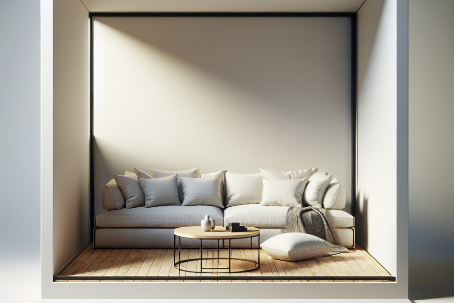
- Interior Design: Effective use of empty spaces can make rooms appear larger and more harmonious.
Key Takeaways
- Negative space, also known as white space, surrounds and separates various elements in a design.
- It’s crucial for readability, drawing attention, and improving the general aesthetics of a design.
- Studies show that proper use of negative space can boost user engagement and reduce bounce rates.
- Successful brands like FedEx, WWF, and IBM effectively use negative space in their logos.
- Negative space is important across different design disciplines, from web and print design to product and interior design.
FAQ
1. What is negative space in design?
Negative space, also known as white space, is the area surrounding and between the main elements in a design. It can help improve readability, focus attention, and enhance visual appeal.
2. Why is negative space important?
Negative space is essential because it makes designs cleaner, more understandable, and aesthetically pleasing. It can guide the viewer’s eye to important parts of the composition.
3. How can negative space improve user experience?
By providing enough space around elements, negative space can enhance readability, reduce clutter, and make it easier for users to navigate and understand the design.
4. Can negative space be a color other than white?
Yes, negative space isn’t limited to the color white. It can be any color, pattern, or even texture that creates clear separation between the design elements.
5. How do famous brands use negative space in their logos?
Famous brands like FedEx, WWF, and IBM utilize negative space creatively in their logos to form shapes and emphasize the design without additional elements, making them more memorable.