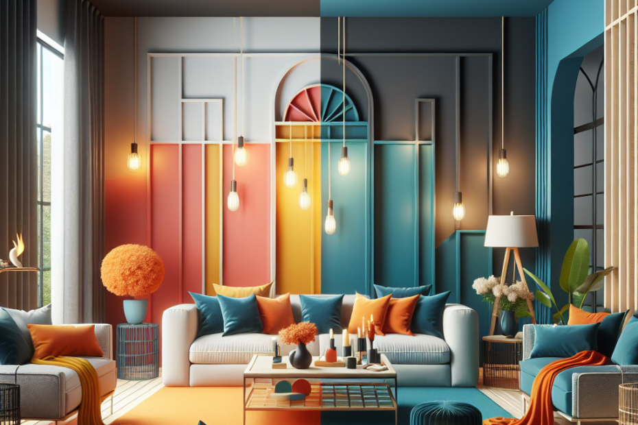
The Power of Contrasting Colors in Home Design
Many homeowners dream of creating a living space that reflects their personality and style. One effective way they can accomplish this is by using contrasting colors in design. Not only does this technique make rooms more visually appealing, but it also influences mood and spatial perception.
Understanding Contrasting Colors
Contrasting colors sit opposite each other on the color wheel. Examples of such pairs include blue and orange, red and green, and yellow and purple. These color combinations are striking and can dramatically alter the feel of a room. According to a study from Sherwin-Williams, rooms featuring contrasting colors are 75% more likely to be viewed as dynamic and energetic than those with monochromatic schemes (Sherwin-Williams).
Benefits of Using Contrasting Colors in Design
| Benefit | Explanation |
|---|---|
| Creates Visual Interest | Contrasting colors draw the eye, making a space feel more lively and engaging. |
| Defines Spaces | Colors can delineate different areas within a room, aiding in multifunctional spaces. |
| Enhances Mood | Bright contrasts can energize, while softer contrasts can soothe the senses. |
Tips for Using Contrasting Colors in Home Design
1. Start Small
They can begin experimenting with contrasting colors on small items like throw pillows, artwork, or rugs. These items are easy to switch out if they decide to change the color scheme later.
2. Use a Neutral Base
A neutral base like white, gray, or beige can help to balance out bold contrasting colors. For example, pairing orange and blue accents against a white backdrop can be both striking and balanced.
3. Balance Bold and Subtle
Incorporating both bold and subtle contrasts can create a harmonious look. They might choose a strong contrast for larger elements, like wall colors, while using softer contrasts for smaller décor pieces.
4. Consider the Room’s Purpose
The purpose of the room can guide their choice of contrasting colors. For a lively living room, they might choose bright, energetic contrasts. For a peaceful bedroom, softer, calming contrasts would be more appropriate.
Experimenting with Patterns and Textures
Contrasting colors in design aren’t only about paint and furniture. Homeowners can mix patterns and textures to create contrast. For instance, combining a smooth leather sofa with a rugged woolen throw, or pairing a sleek glass coffee table with a chunky wooden floor can be visually intriguing.
Study Case: Contrasting Colors in Modern Homes
According to a survey by the American Society of Interior Designers, 68% of interior designers have used contrasting colors to revamp home spaces in the last two years (American Society of Interior Designers). This suggests a growing trend towards bolder design choices. One successful case involves transforming a bland living room with a navy blue accent wall and pale yellow highlights. The result was a refreshingly vibrant space that felt both cozy and energized.
Challenges and Solutions
Color Overload
It’s easy to go overboard with contrasting colors, leading to a cluttered appearance. To avoid this, they can follow the 60-30-10 rule, where 60% of the room’s color is a dominant shade, 30% is a secondary color, and 10% is an accent color.
Finding the Right Contrast
Not all color contrasts complement each other. Using color theory tools or consulting with a professional can help them pick combinations that work well together.
Natural Light
The way light interacts with colors can affect their appearance. Testing how colors look in both natural and artificial light at different times of the day can help them select the best contrasting colors for their space.
Key Takeaways
- Contrasting colors sit opposite each other on the color wheel and create a striking visual impact.
- Benefits include creating visual interest, defining spaces, and enhancing mood.
- Starting small and using a neutral base can help balance bold contrasts.
- Purpose guides color choice; consider room functionality when selecting contrasts.
- Mixing patterns and textures can also create contrast beyond just colors.
FAQ
Q: What are some examples of contrasting colors?
A: Examples of contrasting colors include blue and orange, red and green, and yellow and purple.
Q: How can I use contrasting colors in a small room?
A: In small rooms, they can use contrasting colors on smaller items like pillows and artwork to add visual interest without overwhelming the space.
Q: What if I chose the wrong contrasting colors?
A: They can always repaint or replace decor items if they realize that the selected colors don’t work well together. Starting small with easily changeable items helps minimize risk.
Q: Can I use contrasting colors in a minimalist design?
A: Yes, even minimalist designs can benefit from subtle contrasting colors to prevent the space from looking too bland and to add depth.
Q: How do contrasting colors affect mood?
A: Bright contrasts can be energizing, while softer contrasts can be calming and soothing. The choice of colors can set the tone for the entire room.