“`html
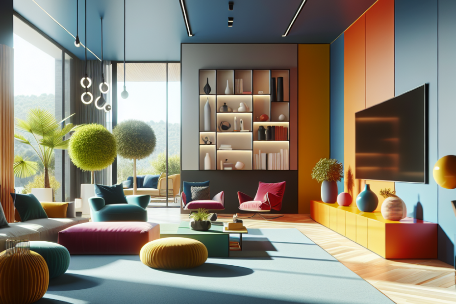
Bold Colors in Modern Design
In today’s world of design, striking visual appeal and intuitive user experiences are paramount. Designers across industries are increasingly incorporating bold colors to create stunning and memorable designs. From graphic designers to interior decorators, they understand the power of bold hues in making a statement and evoking emotions. By focusing on how to effectively use these vibrant tones, one can capture an audience’s attention and enhance product or environmental design.
Understanding the Power of Bold Colors
Bold colors harness the power to stand out and grab attention. They are vibrant, lively, and can be used to evoke a variety of emotions. Designers use them in branding, advertising, or any form of visual communication to influence how audiences perceive their content. Studies show that color increases brand recognition by 80% (SEMRush). Thus, selecting an appropriate bold color palette can significantly enhance the visibility and identity of a brand.
Integrating Bold Colors: Techniques and Tips
It is essential to strategically integrate bold colors into modern design to avoid overwhelming the audience. Here are a few techniques designers use:
1. Accent Elements
They use bold colors as accents to draw focus to key elements in a design. This approach maintains a balance by allowing neutral or muted tones to dominate the design, making the bold accents pop.
2. Color Blocking
Designers often employ color blocking, which involves large areas of bold color juxtaposed with other bold or neutral areas, creating a dynamic and engaging look. This technique is prevalent in fashion design and branding.
3. Contrasting Backgrounds
Pairing bold colors with contrasting backgrounds enhances readability and visual interest. For example, using bright text on a dark background can make the design more appealing and easy to read.
4. Psychological Impacts
They consider the psychological impact of colors. Bold colors can evoke strong emotions; for instance, red can instigate excitement while blue offers tranquility. Understanding these impacts helps in resonating with the target audience effectively.
Trendy Bold Colors in Modern Design
Exploring current trends, designers notice certain bold colors that stand out across various platforms:
1. Hot Pink
Hot Pink is a color of empowerment and fun, often used in campaigns targeting younger audiences.
2. Electric Blue
Electric Blue offers a sense of modernity and freshness, popular in tech industries and futuristic-themed designs.
3. Neon Green
Neon Green represents energy and sustainability, commonly seen in eco-conscious branding.
According to a survey from Behance, 56% of designers believe that electric blue is the most impactful color trend of the year, followed closely by hot pink and neon green.
Key Takeaways
- Bold colors are vital in capturing attention and evoking emotions.
- Strategic usage techniques include accenting, color blocking, and contrasting backgrounds.
- Popular bold colors include hot pink, electric blue, and neon green.
- The psychological impact of color should be considered to effectively reach an audience.
Application Areas
They can apply bold colors in multiple areas to ensure meaningful impact:
| Application Area | Description |
|---|---|
| Branding and Logo Design | Utilizing bold colors to create memorable and recognizable brand identities. |
| Interior Design | Enhancing spaces with bold accents that reflect modern aesthetics. |
| Web Design | Improving user experience and engagement through carefully chosen color schemes. |
| Fashion | Integrating bold colors to create thematic and contemporary styles. |
FAQ
Q1: Why are bold colors popular in modern design?
A1: Bold colors have a unique power to draw attention and evoke emotions, making them valuable for creating impact and memorability in design.
Q2: How can one balance the use of bold colors in a design?
A2: Strategically use them as accent elements or in specific sections like color blocks, paired with neutral tones to balance the overall appearance.
Q3: What are the risks of using too many bold colors?
A3: Overusing bold colors can overwhelm the viewer, making the design look cluttered and challenging to engage with. Balance is essential.
Q4: Which industries benefit most from using bold colors?
A4: Industries like fashion, tech, advertising, and branding greatly benefit as bold colors help create a distinct and memorable brand presence.
Q5: Can bold colors influence consumer behavior?
A5: Yes, the choice of bold colors can significantly influence consumer perceptions and behaviors by evoking certain emotional responses and associations.
“`
This blog post provides insights into using bold colors in modern design, enriched with practical techniques, emerging trends, and key applications. Additionally, it offers a succinct FAQ section to address common queries related to the topic.