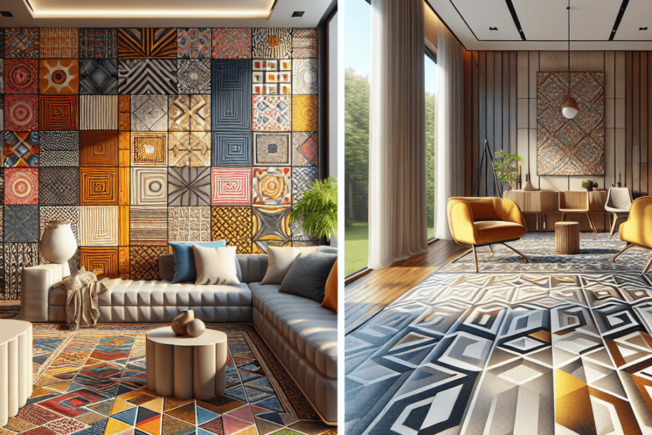
Exploring Geometric Patterns in Contemporary Design
In the world of design, geometric patterns are experiencing a resurgence. Designers today see the value in incorporating these patterns into contemporary design projects. Geometric patterns in design are not bound by trends; instead, they create timeless aesthetic appeals. These designs often symbolize balance, harmony, and order. When used skillfully, these patterns can transform spaces, websites, and even branding into captivating visual experiences.
Understanding Geometric Patterns
Geometric patterns are compositions that use shapes such as circles, squares, triangles, and various polygons in a repetitive manner. These patterns date back to ancient times and have always been popular for their simplicity and adaptability. Today, geometric patterns in design are leveraged to create mood, provide structure, and add visual interest.
According to a study conducted by the Design Management Journal, 67% of respondents report higher engagement with designs that incorporate geometric patterns. (source) This shows the powerful impact these patterns have on an audience.
Applications of Geometric Patterns in Design
Geometric patterns can be applied across various elements of design. They can establish a focal point or serve as a complementary design element. Here are some key areas where geometric patterns can be effectively used:
- Interior Design: Geometric patterns add a modern touch to interior spaces, appearing in tiles, wallpaper, and textiles.
- Graphic Design: From logos to brochures, geometric patterns help in creating visual interest and brand identity.
- Web Design: Website backgrounds and UI elements often use geometric patterns to enhance user experience.
- Fashion: They appear in clothing designs, accessories, and on the runway, adding contemporary flair.
The Psychological Impact of Geometric Patterns
Geometric patterns influence emotions and perceptions. The use of these patterns can evoke feelings of stability, creativity, and energy. For instance, circular patterns are often associated with unity and wholeness, while squares and rectangles suggest reliability and professionalism. This makes them invaluable tools in design strategy.
How to Effectively Implement Geometric Patterns
When incorporating geometric patterns, it’s essential to consider the overall message and tone of the design. Here are some guidelines:
- Simplicity is Key: Avoid overcrowding a design with too many patterns.
- Color Coordination: Use complementary colors that enhance the geometric designs.
- Proportionate Use: Ensure patterns aren’t overwhelming and are balanced with negative space.
- Consistency: Maintain a consistent theme throughout the design to avoid visual chaos.
Real-World Examples of Geometric Patterns in Design
Several brands and designers have successfully integrated geometric patterns into their work:
| Brand/Designer | Application |
|---|---|
| IKEA | Uses geometric patterns in their homeware and textiles for a modern aesthetic. |
| Nike | Incorporates geometric patterns in apparel and footwear designs. |
| Burberry | Utilizes geometric patterns in their iconic plaid design, maintaining brand identity. |
These examples highlight the versatility and widespread applicability of geometric patterns in design.
Key Takeaways
- Geometric patterns create visual interest and engage audiences on multiple levels.
- They can be applied in diverse fields such as interior design, web design, and fashion.
- Careful implementation of geometric patterns enhances aesthetics and communicates desired emotions.
- Consistency and color coordination play crucial roles in successful design outcomes.
FAQs
- Why are geometric patterns popular in design?
They provide structure, visual appeal, and evoke specific emotions, making them versatile across various design domains.
- What industries use geometric patterns?
Geometric patterns are used in interior design, graphic design, fashion, web design, and more.
- How do geometric patterns affect perception?
They can create feelings of stability, creativity, and professionalism depending on the shapes used.
- Should geometric patterns be used sparingly?
Yes, it’s important to maintain balance and not overwhelm the audience with excessive patterns.
- Can geometric patterns disrupt visual hierarchy?
If not used carefully, they can overshadow focal points. Consistency and balance are essential.
