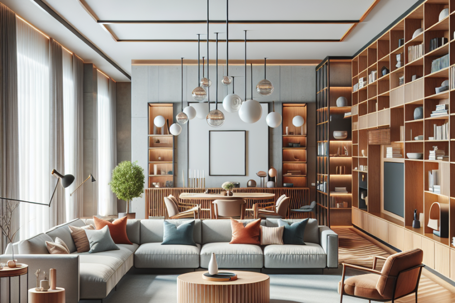
Understanding an Open-Concept Layout
Open-concept layouts are characterized by fewer walls and barriers between different areas like the kitchen, dining, and living room. According to a study by the National Association of Home Builders (NAHB), 70% of new home buyers prefer open floor plans for their main living areas (source). This design promotes easier movement and encourages social interaction.
Key Open-Concept Furniture Tips
To make the most of your open-concept space, consider these essential furniture arrangement tips:
1. Define Different Zones
Use furniture to create distinct zones for different activities. For instance, place a sofa to separate the living area from the dining area. Rugs, bookshelves, and even lighting can further delineate these spaces.
2. Use Consistent Color Schemes
A consistent color scheme helps link the various zones together visually. Neutral base colors with pops of accent colors work particularly well in open spaces, as they maintain cohesion without being overwhelming.
3. Keep Pathways Clear
Ensure there is enough space between pieces of furniture to allow for easy movement. Aim for at least 30 inches between larger items like sofas and dining tables.
4. Choose Multi-Functional Furniture
Opt for furniture that can serve multiple purposes. For example, a storage ottoman can function as seating, a coffee table, or an extra storage space.
5. Consider Furniture Scale and Proportion
Choose furniture that fits the scale of your open-concept space. Large, bulky pieces can make the space feel crowded, while too-small furniture may get lost in the openness.
Example Layout
| Zone | Furniture | Description |
|---|---|---|
| Living Room | Sofa, Coffee Table, TV Stand | Arranged to face a focal point like a fireplace or TV, use a rug to define the area. |
| Dining Area | Dining Table, Chairs | Placed adjacent to the kitchen for easy access, can serve as an informal dividing line. |
| Kitchen | Island, Bar Stools | Kitchen islands provide additional seating and informal dining space. |
Common Mistakes to Avoid
When arranging furniture in an open-concept space, avoid these common pitfalls:
- Overcrowding: Be mindful of not stuffing too much furniture into one space.
- Ignoring Visual Flow: Furniture should be arranged to guide the eye smoothly from one area to the next.
- Lack of Cohesion: Mixing too many different styles and colors can make the space feel chaotic.
Key Takeaways
- Define zones with furniture and accessories.
- Maintain a consistent color scheme to create visual harmony.
- Keep clear pathways for easy movement.
- Opt for multi-functional and appropriately scaled furniture.
- Avoid common mistakes like overcrowding and lack of cohesion.
FAQ
- 1. How can I define different zones in an open-concept space?
- Use furniture, rugs, and lighting to create distinct zones for living, dining, and cooking areas.
- 2. What color scheme works best for an open-concept layout?
- Using neutral base colors with accent colors can create a cohesive and harmonious look in an open-concept space.
- 3. How much space should I leave between furniture pieces?
- Aim for at least 30 inches of space between larger pieces of furniture to allow for easy movement.
- 4. What type of furniture is best for open-concept spaces?
- Multi-functional furniture that serves multiple purposes is ideal for open-concept spaces. Examples include storage ottomans and kitchen islands with bar stools.
- 5. What mistakes should I avoid when arranging furniture in an open-concept space?
- Avoid overcrowding, ignoring visual flow, and incorporating too many different styles and colors, as these can make the space feel chaotic and disorganized.
