Bedroom paint can do more than set a mood. It can make the whole room feel settled, connected, and easier to finish because the walls, bedding, and window treatments stop competing with one another.
If your bedroom feels visually busy, the answer is usually not a bolder color. It is a calmer shade with the right undertone, chosen with the room’s light and the finishes you already have in mind.
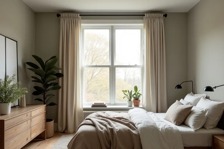
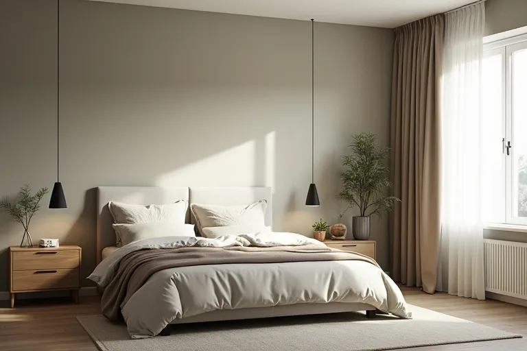
Choose soft, muted colors with similar undertones to your bedding, flooring, and window treatments. That usually means warm white, greige, muted beige, soft sage, dusty blue, or a gentle taupe rather than a bright, high-contrast wall color.
Why calm color matters in a bedroom
A bedroom works best when it feels like one quiet visual system. The wall color, textiles, and furniture should support sleep and everyday routines, not create another thing to manage. Calmer paint colors help because they reduce contrast and let the room read as one whole space instead of a collection of separate pieces.
That is especially useful if your bedroom has a lot of visible elements: a patterned duvet, dark flooring, mixed wood tones, or window treatments that need to look deliberate rather than added at the last minute. A softer wall color gives those pieces a better backdrop.

For many rooms, the best choice is not the most obvious neutral. It is the color that makes the existing finishes look calmer together. If you are still deciding on the overall direction of the room, start by looking at the bedroom as a whole through the design styles lens rather than choosing paint in isolation.
The real decision is not “What color do I like?” It is “What color makes the room’s lighting, bedding, trim, and window treatments feel like they belong together?” If you answer that first, the paint choice usually gets much easier.
How light changes the shade in real rooms
Bedroom paint often looks different at morning, afternoon, and evening. A color that feels soft and balanced in a sample card can turn cooler, darker, or more yellow once it is on all four walls. That is why bedrooms need testing in the actual room, not just under store lighting.
North-facing rooms often make colors feel cooler and can push some neutrals toward gray. South-facing rooms usually bring more warmth and may make beige, cream, or sage read richer. Artificial light matters too, especially if you use warm bulbs at night and daylight during the day. The same paint can look calm in one setting and slightly flat in another.
- Look at the room in natural daylight.
- Check it again in the evening with your usual lamps on.
- Compare the wall sample against bedding, curtains, and floor color.
- Only keep colors that still feel balanced in both light conditions.
If you want to avoid buying too much or too little paint once you settle on a color, use the paint calculator before placing an order. It will not choose the shade for you, but it can help you plan the project more cleanly.

Match paint to bedding, floors, and trim without overthinking it
The easiest way to make a bedroom feel cohesive is to repeat undertones rather than match everything exactly. If your bedding leans warm, a warm white or greige will usually feel more settled than a crisp blue-white. If your floors are cool-toned, a muted gray-green or soft taupe may bridge the room more smoothly.
Think of it as a visual handshake between the main surfaces:
- Bedding: If the fabrics are creamy, linen-like, or earthy, choose paint with a soft warm base.
- Floors: If wood tones are strong, avoid a wall color that makes them look more orange or more dull than they already are.
- Trim: High-contrast trim can sharpen a room; low-contrast trim can calm it.
- Window treatments: Curtains should look planned with the wall color, not like a separate afterthought.
Window treatments matter more than many people expect. If you are trying to install curtains cleanly and keep the room looking composed, a simple adjustable curtain rod matte black can be a practical choice for a restrained, finished look. The goal is not to make the rod noticeable; it is to keep the lines tidy so the paint can do its job.
If you are still sorting out how the whole room should come together, the Bedroom Ideas hub is a sensible place to compare paint, bedding, and layout decisions together instead of treating them as separate purchases.
Simple tests before you commit
Most paint regret comes from skipping the boring part. A calm bedroom color is usually the result of a few careful checks, not a lucky swatch.
Before you buy, do these four things:
1. Put sample paint on more than one wall so you can see it in different light.
2. Check it beside the bedding you actually plan to use, not a placeholder set.
3. Look at it with the curtains open and closed, because window treatment color changes the feel of the room.
4. Leave the sample up long enough to see it at different times of day.
If you want a room to feel calmer overall, keep the rest of the plan simple too. Closed storage under the bed can reduce visual clutter, and a tidy floor line makes a softer paint color feel more intentional. A set of under bed storage containers with wheels is a practical option if you need to clear the room without adding more furniture.
For people who like to plan before they spend, a digital layout and budget tool can also help. The Room Makeover Planner, Home Layout Budget Spreadsheet (Digital Download) is useful if you want to map the room’s priorities before buying paint, curtains, or storage.
Best next step
Confirm the room’s paint direction against the full bedroom plan before you buy. Start with the paint calculator to estimate coverage, then check the color against the room’s light, bedding, and window treatments so the result feels calm instead of accidental.
- Choosing a color only from a photo or small swatch without testing it in the room.
- Picking a paint shade before deciding on bedding, curtains, or other large surfaces.
- Using a high-contrast wall color when the room already has a lot of visual activity.
- Ignoring undertones, which is how a room ends up feeling disconnected even when every piece is technically neutral.
- Using window treatments that feel unfinished, which can make the walls look less cohesive too.
The calmest bedroom paint colors are usually soft, muted shades with undertones that align with the room’s bedding, flooring, trim, and curtains. If the room already feels busy, lower the contrast instead of chasing a trend color. Test in real light, keep the finishes coordinated, and use the room as one plan rather than a series of separate choices.
Helpful next tools and planners
If you want to make the decision easier before you buy
These are the most practical add-ons for this kind of room update: one tool to plan paint coverage, one planner to keep the project organized, and one storage option that helps the room stay visually quiet.
FAQ
What bedroom paint colors feel the calmest?
Soft whites, greige, muted beige, gentle taupe, dusty blue, and muted sage tend to feel calm because they lower contrast and work well with layered bedding.
Should bedroom walls be lighter or darker for a calmer feel?
Usually lighter or mid-depth shades feel calmer because they reflect more light and make the room feel more open. A deeper shade can still work if the rest of the room is simple.
How do I choose a paint color if my bedroom has warm wood floors?
Look for a shade with a warm or balanced undertone so the floor does not look too orange or too yellow by comparison.
Do curtains affect how bedroom paint looks?
Yes. Curtain color and fabric can change how the wall color reads, especially near windows. That is why it helps to test paint with the window treatments you plan to keep.
Three sensible next steps
Some links in this article may be affiliate links. Read more in the Affiliate Disclosure.