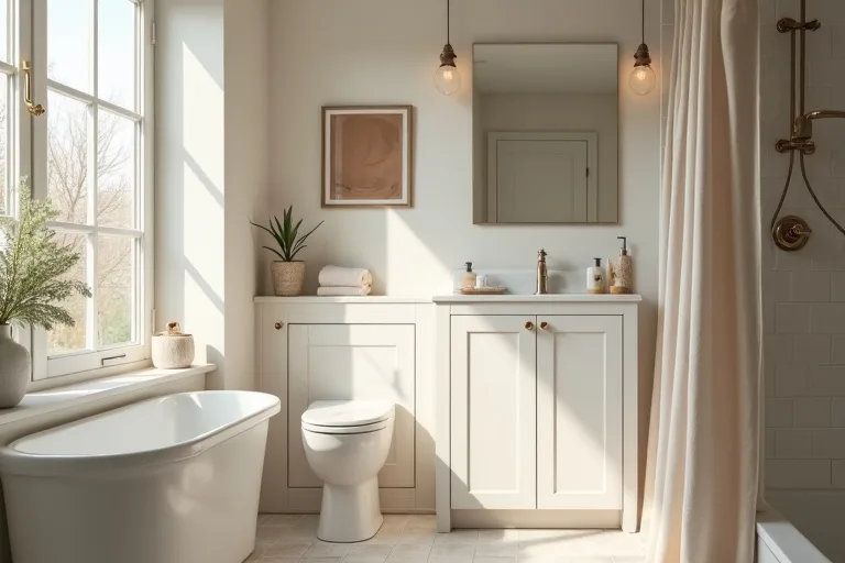
Bathroom paint can look calm on a sample card and surprisingly different once it is on the wall. That shift is usually not about the colour itself. It is about light, reflection, room size, and the finishes already in the room.
If your bathroom has ever ended up feeling colder, darker, or smaller than expected, the problem is often a simple planning mistake. The good news is that you can avoid most of them before you buy a full set of samples.
The biggest mistake is choosing a color without checking how your bathroom light changes it. In a small room, morning light, evening bulbs, tile shine, and paint finish can all shift the result enough to make a shade feel wrong.
Why bathroom paint changes in real light
Bathrooms are among the most changeable rooms in a home. Natural light is often limited, artificial light is usually on for most of the day, and reflective surfaces can bounce colour around in ways that are hard to judge from a paint chip.
A soft neutral can feel airy near a bright window, then look grey or flat once the overhead light comes on. A warm white may look clean in the morning and slightly yellow at night. Even a colour that seems safe on paper can feel out of balance if the room has one strong light source and several glossy surfaces.
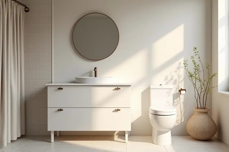
That is why bathroom paint decisions are better made in the room, not in the store. Look at the walls at different times of day and decide whether you want the colour to soften the room, brighten it, or quietly disappear behind the fixtures.
If a colour sample looks good only once, that is not enough. Check it beside the mirror, near the vanity, and on a wall that catches both daylight and artificial light. If the shade changes too much from one spot to another, choose something slightly more muted and easier to live with.
The room-size mistake that makes bathrooms feel off
Many bathroom paint problems come from ignoring scale. A colour that feels balanced in a larger room can seem crowded in a compact bathroom, especially if the space has a lot of visual interruption from tile lines, towel bars, shelving, and plumbing.
When the room is small, strong contrast can work against you. Dark trim, bright walls, and high-gloss surfaces can break the room into pieces, which makes the walls feel closer. On the other hand, a very flat, pale colour with no undertone can feel unfinished or cold.
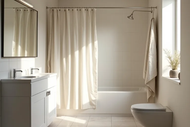
For most bathrooms, the safest direction is not the brightest white or the deepest mood colour. It is a shade with enough softness to hold up under changing light and enough depth to avoid looking chalky.
- Start with the size of the room, not the colour trend.
- Decide whether the walls should recede or become a feature.
- Choose a colour that keeps the room visually calm around the fixtures and tile.
Finish, fixtures, and surfaces matter too
Paint colour does not sit alone in a bathroom. It has to work with the tile, counter, mirror, hardware, and even soft items like a shower curtain or bath mat. If those pieces pull in different directions, the room can feel unsettled even when the wall colour is technically fine.
Finish is part of that decision. A very shiny finish can reflect too much light and highlight uneven surfaces. A very flat finish may look soft, but it can also make a bathroom harder to keep looking clean. The better choice usually sits in the middle: enough sheen to stand up to moisture, but not so much that every flaw shows.
Soft texture can help the whole room feel more settled. A neutral fabric shower curtain, for example, can make a painted bathroom feel less hard-edged without adding more visual noise. If storage is part of the problem, it is usually better to simplify what is visible before reaching for a stronger paint colour.
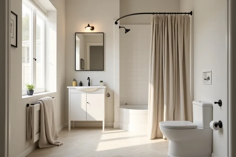
That is especially useful in bathrooms that already have mixed finishes. A steady wall colour can bridge warm wood, cool tile, and white ceramics better than a high-contrast choice.
Simple checks before you buy paint
Before you commit, test the colour in the room and compare it against the things that do not change: tile, vanity, floor, and ceiling. Put the sample where you actually see it first thing in the morning and again at night.
If you are unsure, narrow the choice by asking a few practical questions:
- Does the colour look calmer next to the actual fixtures?
- Does it hold up in both daylight and artificial light?
- Does it make the room feel more open, or more closed in?
- Does the finish hide enough to feel realistic for daily use?
At this stage, it helps to estimate how much paint you need before buying. That keeps the project grounded and avoids the common mistake of sampling one colour too many or under-ordering the wrong finish. Use the paint calculator as a planning check, then move to your samples with more confidence.
Best next step
If you want a calmer paint decision, start with coverage and room planning before you buy samples. That makes it easier to choose a colour that fits the bathroom instead of fighting it.
- Choosing a colour from a small chip without testing it in the bathroom light
- Picking a shade that is too stark for a small room
- Using a finish that shows every reflection or flaw
- Ignoring the tile, vanity, and hardware already in the room
- Letting a trend colour do the work that layout and soft texture should do
The safest bathroom paint choice is usually the one that works quietly with the room you already have. Check how the light changes the colour, make sure the finish suits the space, and keep the surrounding materials in mind. A softer, more balanced shade often looks better in real life than a stronger colour that only looked right in the store.
Helpful next tools and planners
If you want to make the decision easier before you buy
A few simple planning tools can help you avoid waste and keep the room feeling calm. These are most useful after you have narrowed the colour direction and want to sanity-check the rest of the update.
FAQ
What bathroom paint color looks best in low light?
Usually a soft, muted shade with some depth works better than a very bright white. It keeps the room from feeling harsh while still helping the space feel open.
Should bathroom walls be painted in satin or matte?
A finish with some sheen is often more practical in a bathroom because it handles moisture better and is easier to wipe down. Too much sheen can make flaws more visible.
Why does my bathroom paint look different at night?
Artificial light changes the undertone of paint. Warm bulbs can make some colours look creamier, while cooler bulbs can make them feel grey or flat.
How many samples should I test?
Start with a small, focused group of colours instead of too many options. Testing fewer shades makes it easier to compare how each one behaves in your actual space.
Three sensible next steps
Some links in this article may be affiliate links. Read more in the Affiliate Disclosure.