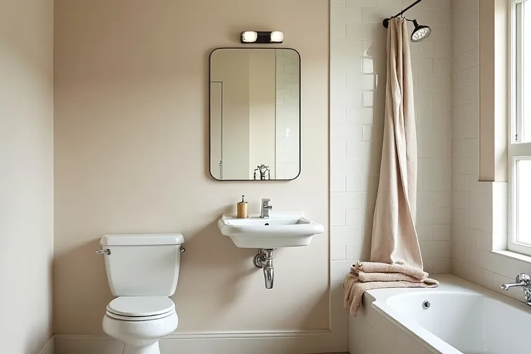
Bathroom paint can do a lot of quiet work. It can make a small room feel less cramped, help older fixtures look better, and tie together tile, vanity, and hardware without forcing a full remodel.
The easiest way to choose well is to start with what the room already gives you: daylight, size, and fixed finishes. Once those are clear, the right shade is usually easier to spot.
Choose a bathroom paint color based on light, room size, and finishes first, then narrow to a calm shade that works with your fixtures. If you are unsure how much paint you need, use the paint calculator before you buy.
Start with light, size, and fixed finishes
The same color can look soft and balanced in one bathroom and flat or muddy in another. Bathrooms are especially sensitive because most of them have a mix of hard surfaces, reflective fixtures, and changing light through the day.
Begin by looking at three things that will not change quickly: the amount of natural light, the size of the room, and the finishes already in place. White tile, beige stone, chrome taps, warm brass, and painted vanity fronts all affect how the wall color reads.
In a small bathroom, lighter colors often feel safer because they keep the room open. In a larger bathroom, you have more room to use a slightly deeper neutral or a muted color without making the space feel heavy. If the room is dark, a color with too much gray can feel colder than expected. If the room gets strong daylight, some colors can look sharper or more washed out than they do on the paint card.
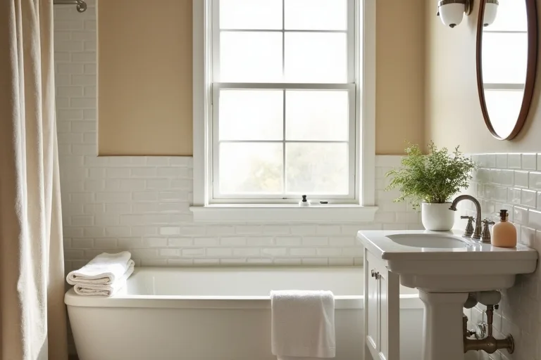
The real decision is not just which color looks nicest on a sample card. It is which shade still looks steady when it meets your tile, vanity, mirror, and daylight. If those fixed elements are warm, a cool color may feel out of place. If the room already has cool surfaces, a warm beige may help it feel calmer.
Choose a color family that suits the room
There is no single best bathroom color. The best choice depends on the feeling you want and how much visual space the room has. A calm bathroom usually works best with one of a few reliable color families.
Soft whites and off-whites are useful when you want the room to feel fresh and light without looking stark. Warm neutrals can soften tile and make a bathroom feel more settled. Pale greiges often work well when you want a balanced look that sits between warm and cool. Muted blue-greens can suit bathrooms with natural light and a cleaner, more restful feel, as long as the undertone matches the rest of the finishes.
If you are working with a compact room, avoid colors that rely heavily on the paint chip rather than the room itself. Small bathrooms can make color feel stronger, especially on multiple walls. In larger rooms, you can be a little more confident with depth, but it still helps to keep the tone quiet enough that the room does not feel busy.
When you are also planning the overall style direction, it helps to compare color choices with your broader home style. The design styles page is useful if you want the bathroom to connect more naturally with the rest of the home.
Check undertones and sheen before you commit
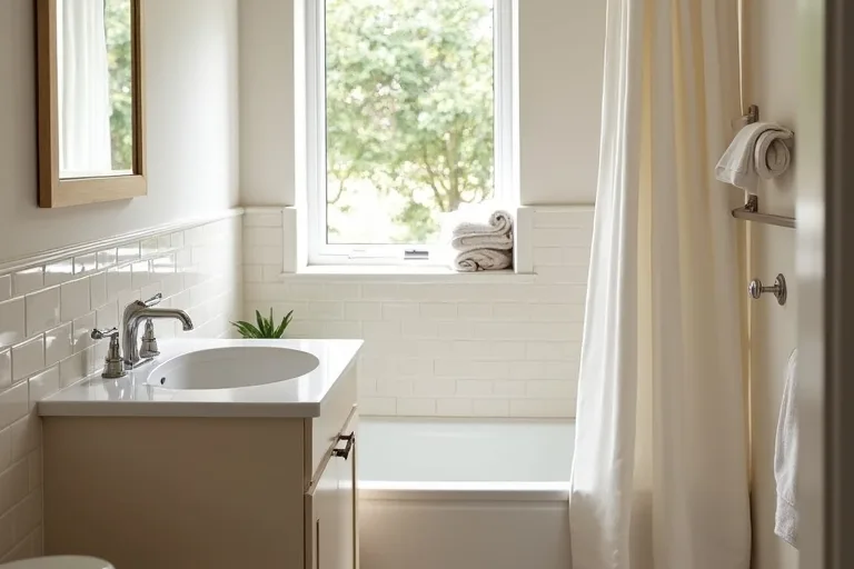
Undertone is where many bathroom paint choices go wrong. A color may look like a simple beige, gray, or white on the sample, but in your bathroom it may lean pink, green, yellow, or blue. That shift usually shows up because of the light, the tile, and the nearby fixtures.
This is why it helps to test the color next to the surfaces it must live with. Put samples beside the vanity, near the shower or tub edge, and close to the mirror where light bounces around most. Check the sample in the morning, midday, and evening if you can.
Sheen matters too. Bathrooms usually need a finish that can handle moisture and wiping, but the gloss level changes the look. A flatter finish can feel softer, while a more durable satin or eggshell-style finish may be easier to maintain. The best choice is usually the one that balances appearance with cleaning and daily use.
If you want to keep the project manageable, estimate paint needs early instead of guessing. That is one of the simplest ways to avoid buying too little or too much. You can also use a small room budget planner if you want to map out the refresh before you commit to paint, accessories, and storage.
- Paint sample boards instead of tiny swatches.
- Move them around the room instead of leaving them in one spot.
- Test them beside tile, trim, vanity, and metal finishes.
- Look at them when the room is lit naturally and artificially.
- Decide only after the color still feels right in more than one condition.
Match the paint with simple styling and storage updates
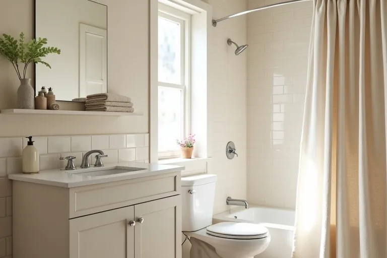
Bathroom paint looks best when the rest of the room is quiet enough to support it. A neutral shower curtain, a simple towel palette, and one or two tidy storage pieces can make the color feel intentional instead of accidental.
This is also where a small refresh can be more effective than a full repaint-and-redecorate project. If the room already has the right wall color, changing the soft furnishings may be enough. If the room feels visually cluttered, a few practical updates can help the new paint read more clearly.
An neutral fabric shower curtain set is a simple way to soften the room, while an over toilet storage shelf bathroom can help reduce the sense of clutter. If you want to plan the room update properly before buying, the Room Makeover Planner, Home Layout Budget Spreadsheet is a practical way to map choices in advance.
Best next step
If you are close to choosing a color, estimate the paint first so the project feels manageable. The paint calculator is the most useful next step when you want to confirm coverage, avoid overbuying, and make the refresh easier to plan.
- Choosing a color from a tiny sample without testing it on the wall.
- Ignoring the undertone of existing tile, vanity, or flooring.
- Selecting a shade that looks good in daylight but harsh at night.
- Using a finish that is attractive but not practical for bathroom conditions.
- Trying to balance a busy room with an equally busy wall color.
The best bathroom paint color is the one that works with your light, fixtures, and room size, not just the one that looks good on a chip. Start with the fixed finishes, test the undertone carefully, and choose a sheen that suits the room. Once the wall color is settled, keep the rest simple with soft texture and a little storage so the bathroom feels calm and easy to live with.
Helpful next tools and planners
If you want to make the decision easier before you buy
These are useful if you are still narrowing the plan and want a calmer way to compare paint, styling, and storage before spending money.
FAQ
What bathroom paint colors make a small bathroom feel bigger?
Light neutrals, soft whites, and pale warm tones usually help a small bathroom feel more open. The key is choosing a color that works with the room’s light rather than one that looks bright only on a sample card.
Is satin or eggshell better for bathroom walls?
Both can work, but the better choice depends on how much moisture and wiping the room gets. A slightly more durable finish is usually easier to live with in a bathroom, as long as it still looks calm on the wall.
How do I know if a paint color has the wrong undertone?
Test it beside your tile, vanity, and hardware. If it suddenly looks pink, yellow, green, or blue in a way you did not expect, the undertone may be competing with the room.
Should bathroom paint match the rest of the house?
It does not have to match exactly, but it should feel related. A bathroom looks more settled when its color supports the wider style of the home instead of fighting it.
Three sensible next steps
Some links in this article may be affiliate links. Read more in the Affiliate Disclosure.