Bedroom paint color decisions are easier when you treat them as part of a room plan, not a stand-alone style choice. The best color is the one that works with light, layout, furniture, and how you want the room to feel at the end of the day.
If you are trying to narrow the field, start with the practical basics first. A bedroom that feels restful in the morning light may look completely different at night, and that is often where the wrong choice gets made.
Choose bedroom paint colors by starting with light, room size, and the mood you want the room to support. Then test a few samples on real walls before you commit, because the same color can look warmer, cooler, lighter, or darker depending on the room.
Start with mood and daylight
The first question is not whether a color is trendy. It is what kind of room you want to wake up to and wind down in. Bedrooms usually work best when the paint supports rest, softness, and a simple visual rhythm rather than competing with the furniture or bedding.
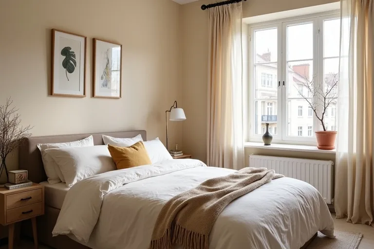
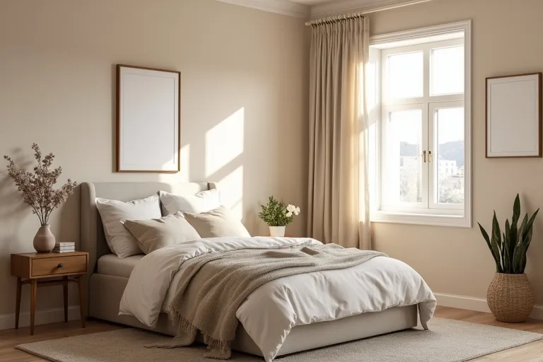
Natural light changes everything. A room with bright morning sun can make pale neutrals feel sharper, while a north-facing room can pull cool colors toward gray or blue. Warm neutrals, muted greens, soft clay tones, and gentle greiges often feel calmer in spaces that need a little more warmth.
If your bedroom has strong daylight, you can usually go a little deeper without the room feeling closed in. If it is small or dim, lighter colors often help the walls recede and keep the space feeling open.

The real decision is not just which color looks nice on a swatch. It is whether the color still feels right in your bedroom’s actual light, with your bed, curtains, and flooring in place. If you are choosing between two shades, choose the one that works better in the room you already have, not the one that looks better online.
Match color to room size and layout
Bedroom paint should help the room feel balanced. In a compact room, lighter paint often makes the walls feel farther away, which can reduce visual clutter. In a larger bedroom, a mid-tone or deeper shade can make the space feel more grounded and intentional.
Layout matters too. A long narrow room may benefit from one stronger end wall or a slightly warmer color that softens the shape. A bedroom with awkward corners, built-ins, or a wall of windows often does better with a simpler palette so the architecture does not fight the paint.
Use the room’s function as your guide:
- If the bedroom is mainly for sleep, keep the palette quiet and low-contrast.
- If the room also includes a reading corner or desk, choose a color that feels steady rather than overly dark.
- If the room has large furniture pieces, let the wall color support them instead of competing for attention.

Work with trim, ceiling, and textiles
Wall color does not work alone. Trim, ceiling paint, curtains, bedding, rugs, and even the finish on your furniture all change how the room reads. A crisp white trim can make a wall color feel cleaner and more defined, while a softer off-white trim can create a quieter transition.
Ceilings deserve attention too. A bright white ceiling can keep a room feeling taller, but in some bedrooms a slightly softer ceiling tone feels less stark. If the walls are already strong, a calmer ceiling and trim choice often keeps the room from feeling busy.
Textiles are the final filter. A bedroom with cool-toned bedding, matte metal finishes, and simple blinds will read differently from a room with warm wood, linen curtains, and layered neutrals. If you are planning window treatments, it helps to think about the paint and curtain relationship at the same time so the room feels deliberate. A clean adjustable curtain rod in matte black can work well in a modern room where you want the window treatment to look neat rather than decorative.
When you are coordinating the whole room, it can help to step back and review your overall design direction on the Design Styles page, especially if you are deciding between warm minimal, soft traditional, or something more modern and restrained.
Test samples before you commit
Testing paint on the wall is the step that saves most people from a costly mistake. A color chip is only a suggestion until you see it beside your flooring, bedding, trim, and windows at different times of day.
Put the samples where you will actually notice them: near the headboard wall, next to the window, and on a wall that gets less natural light. Watch them in morning light, afternoon light, and at night with the lamps on. That is usually where the real choice becomes clear.
If you are still planning the rest of the room, this is also a good moment to sort out what needs to fit under the bed and what can be hidden away. Under bed storage containers with wheels are a simple way to reduce visual clutter in smaller bedrooms without changing the paint choice itself.
Before you buy, estimate the paint amount with the Styling Homes paint calculator. That gives you a practical sense of coverage and budget before you commit to a color, which is often the point where the decision becomes easier.
Best next step
Once you have a color direction, use a simple planning step to make the project feel manageable. Estimate how much paint you need, then think about how the new wall color will work with curtains, bedding, and furniture so you are not solving those pieces one by one after the paint is chosen.
- Choosing a color from a small swatch without testing it on the wall.
- Ignoring how morning and evening light change the same paint.
- Picking a shade that clashes with trim, flooring, or the bed frame.
- Using too many strong tones in a small bedroom.
- Forgetting to plan curtains and textiles before finalizing the wall color.
The best bedroom paint color is the one that suits the room’s light, size, and mood, not just the one that looks good in isolation. Keep the palette calm, test samples in real conditions, and use the surrounding finishes to make the final choice feel intentional.
Helpful next tools and planners
If you want to make the decision easier before you buy
A few practical tools can help you move from color idea to a room plan that actually works. Use them to keep the project calm, organized, and tied to the budget and layout you already have.
FAQ
What bedroom paint colors make a room feel calmer?
Soft neutrals, muted greens, gentle taupes, and warm off-whites often feel calmer because they reduce contrast and keep the room visually steady.
Should a small bedroom always be painted white?
No. Light colors can help a small room feel open, but a soft mid-tone can also work if you want the room to feel cozy and balanced.
How many paint samples should I test?
Usually two to four is enough. More than that can become confusing, especially if the shades are very similar.
When should I choose paint relative to curtains and bedding?
Ideally, think about them together. The wall color should support the textiles and window treatments, not force you to replace them later.
Three sensible next steps
Some links in this article may be affiliate links. Read more in the Affiliate Disclosure.