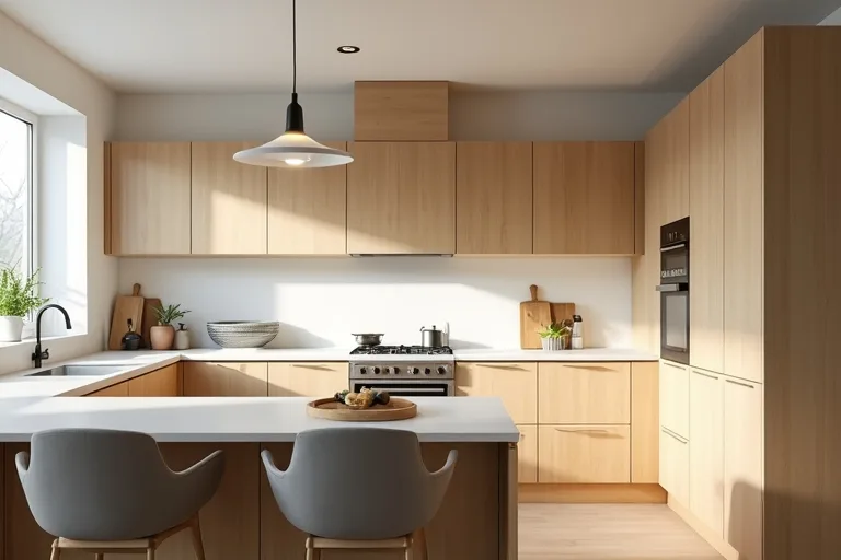
Choosing kitchen paint colors gets easier when you treat it like a planning decision, not a decorating one. The right wall color should work with the room you already have: the amount of light, the cabinet finish, the floor, and the way the kitchen is used every day.
If you start with those basics, you can narrow the options quickly and avoid buying paint that looks good on a sample card but feels wrong in the room. That is usually what makes kitchen projects feel messy; the color choice was made before the room was really understood.
Choose a kitchen paint color by first checking light, cabinet color, and room size. Then pick a shade that supports those conditions instead of competing with them.
Start with the kitchen problem the paint needs to solve
Before you think about color families, decide what the walls need to do. A kitchen may need to feel brighter, calmer, warmer, less busy, or more connected to an adjoining dining area. That decision narrows the field in a useful way.
For example, a small kitchen with limited daylight often benefits from a soft, light-reflecting neutral rather than a strong color that visually closes the room in. A kitchen with warm wood cabinets may need a balanced wall shade that keeps the wood looking intentional, not heavy. If the room opens into a dining space, the wall color should help the two areas feel related.
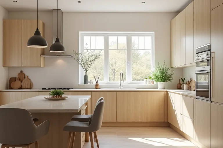
It helps to think in terms of outcome first and color second. If your goal is a calmer kitchen, look for soft neutrals, muted greens, or dusty blue-greys. If your goal is a brighter kitchen, lighter warm whites and pale greiges usually do more work than saturated colors. If the kitchen already has a lot of visual activity in the tile or counter, a quieter wall color usually gives the room better balance.
The real decision is not just which paint looks nicest on a swatch. It is which color solves the room’s biggest problem without creating a new one. If the kitchen feels dark, choose for brightness. If it feels cluttered, choose for visual calm. If the cabinetry is the main feature, choose a wall color that lets it lead.
Check light, cabinets, counters, and floor together
Kitchen paint colors rarely fail on their own. They usually fail because they were chosen without enough attention to the fixed finishes around them. Cabinets, counters, flooring, and backsplash all affect how the wall color reads.
Natural light matters too. A color that looks soft in a north-facing room can look dull in another kitchen with cooler light. Artificial light can also shift the result after dark, especially if the room is lit by strong overhead fixtures only. For that reason, test paint samples in more than one spot and at more than one time of day.
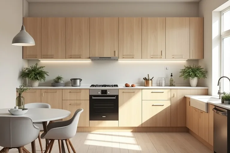
A simple way to compare your options is to look at them in this order:
- First, identify whether the cabinets are warm, cool, painted, or natural wood.
- Then check whether the counters and flooring lean warm or cool.
- After that, test paint samples against those finishes, not by themselves.
- Finally, look at the wall color in daylight and again under evening light.
If the kitchen has a lot of warm finishes, a cool white can feel abrupt. If the finishes are already cool, a beige that is too yellow can make the room feel mismatched. Neutral does not mean invisible; it still needs to sit comfortably with the rest of the room.
Choose a safe color direction before you compare paint cards
Most kitchens work better with a restrained palette than with a bold one. That does not mean the room has to be plain. It means the paint should support the layout, the cabinetry, and the amount of light you have.
In many homes, the safest options fall into a few broad groups. Soft warm whites work well when you want brightness without a stark look. Greige can bridge warm cabinets and cooler counters. Muted sage and blue-grey shades can add character while staying calm enough for everyday use. Deeper colors can work too, but they usually need more light and more confidence in the rest of the room scheme.
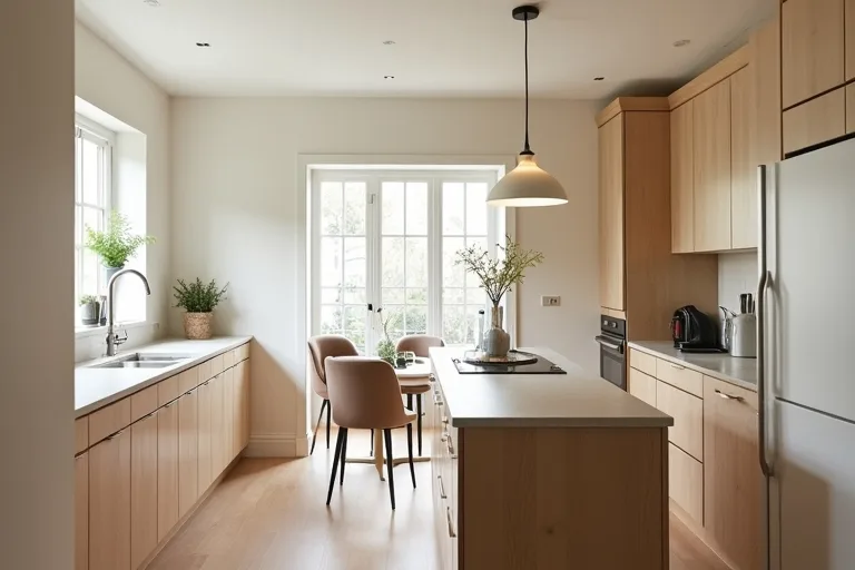
When the kitchen opens into a dining zone, keep the transition in mind. A wall color that feels pleasant in the kitchen should also sit comfortably beside the dining furniture and lighting. This is where a more complete room plan helps: the paint should work with the chairs, the pendant light, and the overall flow instead of fighting them.
If you want a more finished result without overspending, focus on the relationship between the wall color and the fixed elements first. Then let accessories and textiles do the softer styling. That is often enough to make the whole room feel considered.
Think about finish, durability, and the final buying plan
In a kitchen, sheen matters almost as much as color. Higher sheen finishes are easier to wipe down, but they can also highlight imperfections in the wall. Lower sheen finishes tend to feel softer and more forgiving, though they may need a bit more care depending on the paint and the wall surface.
The best finish is the one that suits the room’s use. A busy family kitchen may need a more practical wipeable finish than a low-traffic space. If the walls are uneven, a softer sheen can help the room look calmer. Once you know the color direction and the finish, you can move from guessing to planning the actual purchase.
That is where a paint calculator becomes useful. It helps you estimate how much paint you need before you buy, which makes the project easier to budget and easier to finish in one go. If you are also rethinking the room as a whole, it is worth aligning the color choice with broader style planning so the kitchen feels coordinated rather than pieced together.
For a practical next step, use the Styling Homes paint calculator to turn your color decision into a simple buying plan. If you are still deciding what overall look the room should support, the design styles page is a sensible place to narrow the direction before you commit.
Best next step
If you have narrowed your kitchen paint color choice but have not bought anything yet, move from color picking to planning. Estimate how much paint you need, then check how the color fits the wider room style before you shop.
- Choosing a color from a chip without testing it against cabinets and counters.
- Ignoring how the room looks in evening light.
- Picking a finish that is too flat for a high-use kitchen.
- Using a strong color when the room already has busy finishes.
- Forgetting how the kitchen connects to nearby dining or living areas.
The most reliable way to choose kitchen paint colors is to start with the room’s needs, then test those colors against the light and the fixed finishes. If the wall color supports the cabinets, counters, and layout, the kitchen will feel calmer and more intentional. Once you have that direction, use the paint calculator to plan the purchase with less guesswork.
Helpful next tools and planners
If you want to make the decision easier before you buy
These are useful if your kitchen update is part of a broader comfort-led dining or layout refresh. Keep the planning simple first, then add pieces that support the room rather than crowd it.
FAQ
What is the safest kitchen paint color if I do not want to make a mistake?
Soft warm whites, light greiges, and muted neutrals are usually the safest starting points because they are easier to match with cabinets, counters, and flooring.
Should kitchen walls match the cabinets?
Not exactly. They should work together. A little contrast usually gives the room more depth and helps the cabinets feel intentional.
Do kitchen paint colors look different under artificial light?
Yes. Many colors shift noticeably at night, which is why sample testing under both daylight and evening light is important.
What finish is best for kitchen walls?
A practical, wipeable finish is usually best for a kitchen. The exact sheen depends on how much wear the walls get and how smooth the surface is.
Three sensible next steps
Some links in this article may be affiliate links. Read more in the Affiliate Disclosure.