## Designing with Retro Colors for a Nostalgic Look
People across generations often find themselves drawn to styles from the past. Retro colors in design have gained significant popularity as they evoke a sense of nostalgia and warm familiarity. These color palettes bring the essence of bygone eras into contemporary spaces, creating an inviting and chic vibe while preserving modern comfort.
### Understanding Retro Colors
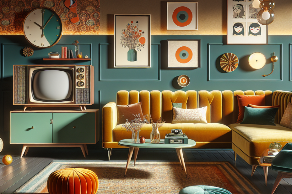
Retro colors refer to palettes commonly seen in design and fashion from previous decades, particularly popular from the 1950s to the 1980s. These include mustard yellows, avocado greens, pastel blues, and dusty pinks—a mix that gives an ode to mid-century aesthetics. By integrating these colors, designers successfully bridge the past with the present, crafting spaces and products that feel eternal yet fresh.
### The Nostalgia Effect
Nostalgia plays a significant role in our attraction to retro designs. Studies have found that nostalgia can improve mood and promote feelings of social connection, even serving as a coping mechanism for today’s fast-paced lifestyle (Source: Psychology Today). By incorporating retro colors, designers tap into this psychological effect, designing spaces that feel both comforting and timeless.
### Popular Retro Color Combinations
A well-executed retro design often relies on specific color combinations known for their vintage appeal. Here are a few examples:
1. **Earthy Tones**: Mustard yellow and avocado green.
2. **Pastel Mix**: Soft pink, powder blue, and mint green.
3. **Vivid Contrast**: Burnt orange and navy blue.
4. **Warm Browns**: Chocolate brown with soft caramel or cream.
These combinations not only reflect popular choices from past decades but are also versatile for creating modern spaces that can adapt to changes over time.
### Why Use Retro Colors?
Retro colors offer several benefits that are increasingly recognized in design:
– **Timelessness**: They have a classic appeal that doesn’t go out of style.
– **Versatility**: Suitable for both vintage and modern settings.
– **Emotional Connection**: Evoke pleasant memories and warmth.
– **Unique Aesthetic**: Stand out from a world dominated by minimalist palettes.
According to a 2022 survey by the Interior Design Institute, 65% of interior designers noted a rise in client requests for retro-inspired spaces, attributing this trend to the emotional and aesthetic appeal of retro aesthetics.
### Integrating Retro Colors into Modern Design
While the charm of retro hues is undeniable, it’s important to integrate them seamlessly into current design trends. Here are some tips:
– **Accent Walls**: Use a bold retro color on a single wall to create a focal point.
– **Textiles**: Incorporate retro shades in fabrics like cushions, curtains, or rugs.
– **Furniture and Decor**: Choose vintage-style furniture and mix them with modern accessories.
– **Artwork**: Pick art that reflects retro designs or features iconic prints and patterns.
### Retro Colors in Digital Design
In the digital realm, retro colors have also seen a resurgence. Websites, apps, and marketing materials increasingly leverage vintage palettes to attract audiences looking for something unique. The use of soft pastels and warm tones adds a human touch to digital interfaces, often enhancing user experience by invoking comfort and curiosity.
### Key Takeaways
– Retro colors in design effectively connect the past with the present.
– Nostalgia has a psychological impact, making retro colors appealing.
– Popular retro palettes are diverse, ranging from earthy to pastel tones.
– Retro colors offer timeless and versatile design options.
– They are increasingly used in both physical and digital spaces.
### A Glimpse at Retro Color Trends
| Decade | Popular Colors | Key Influences |
|——–|———————–|———————————-|
| 1950s | Pastel pink, mint | Mid-century modern culture |
| 1960s | Psychedelic, vibrant | Pop art and counterculture |
| 1970s | Earthy browns, oranges| Nature and the bohemian lifestyle|
| 1980s | Neon, bright pastels | Bold fashion and pop culture |
Retro colors have a gravitational pull, mirroring significant cultural moments while maintaining a fresh allure.
### FAQs
**1. What are retro colors in design?**
Retro colors in design refer to color palettes that were popular in past decades, such as the 1950s to 1980s, including earthy tones, pastels, and vibrant hues.
**2. Why are designers using retro colors today?**
Designers are using retro colors because they evoke nostalgia, create emotional connections, and offer timeless and unique aesthetics that can stand out in modern designs.
**3. How can retro colors be integrated into a modern home?**
Retro colors can be integrated through accent walls, textiles, vintage-style furniture, and artwork, blending with modern elements to maintain current trends while adding nostalgic charm.
**4. Are retro colors suitable for digital design?**
Yes, retro colors are suitable for digital design as they add warmth and a human touch to digital platforms, enhancing user experience with their inviting nature.
**5. What is the psychological impact of retro colors?**
Retro colors trigger nostalgia, which can improve mood, evoke feelings of comfort and connection, and serve as an effective coping mechanism in a fast-paced world.