“`html
Understanding Light and Dark Accents in Design
In the world of design, contrasts are crucial for creating visually appealing work. By using light and dark accents, designers can enhance the mood and draw attention to certain areas of the design. Whether they are decorating a room, designing a website, or creating art, a well-thought-out use of light and dark contrasts can make a significant difference.
Light and Dark Accents: The Basics
Light and dark accents involve using colors and shades to create contrast and interest. Light accents can include whites, off-whites, and pastels, while dark accents might consist of black, deep browns, and navy blues. This opposition between light and dark elements helps in defining shapes, guiding the viewer’s eye, and inferring depth and space in a composition.
The Importance of Contrast
According to a study by the Interaction Design Foundation, high-contrast designs are more likely to capture the viewer’s attention within the first few seconds (Interaction Design Foundation, 2020). This demonstrates how crucial contrast is in grabbing attention and creating focal points. Light and dark accents also play an essential role in accessibility, as designs with a stark contrast are often easier to read or interpret by those with visual impairments.
Strategies for Using Light and Dark Accents
They can utilize several strategies to incorporate light and dark accents into their designs effectively:
- Alternate Dominance: Let either light or dark colors dominate the design, then use the contrast to highlight specific features or sections.
- Consider the Balance: When employed judiciously, light and dark colors can create a balanced composition that holds the viewer’s attention.
- Experiment with Saturation: They can enhance or soften the overall effect of contrast by adjusting the saturation levels of the colors used.
- Utilize Neutral Tones: Pair light and dark colors with neutral hues to create a more subdued yet effective contrast.
Examples and Applications
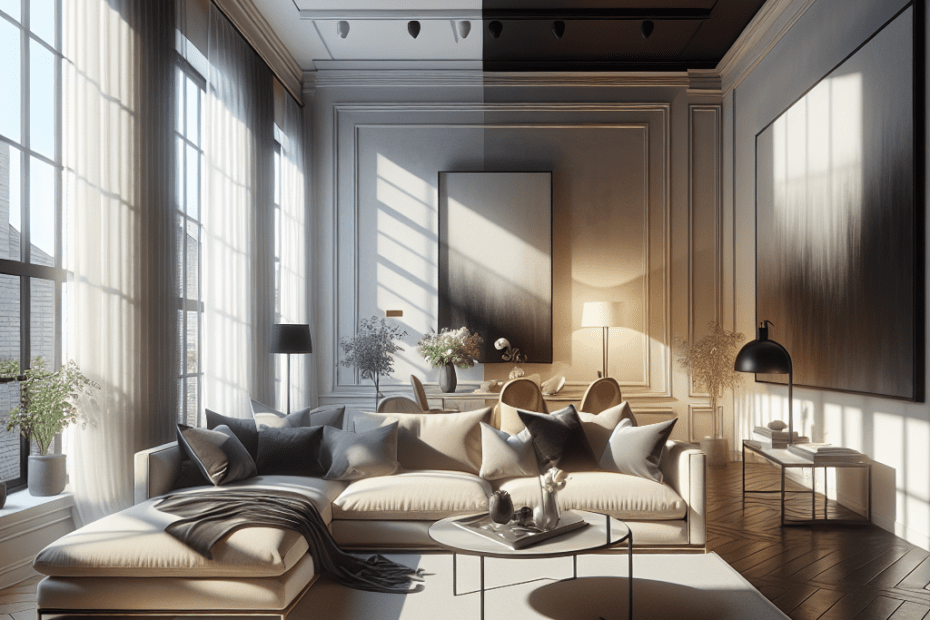
Understanding how to apply these contrasts can transform a mundane design into an exceptional one. For instance, a dark accent wall in a room painted with light colors can make the space more dynamic and intriguing. Similarly, a website with a dark navigation bar against a light background can help users locate key information quickly.
| Application | Light Accents | Dark Accents |
|---|---|---|
| Interior Design | Pastel colors, light neutrals | Deep navy, charcoal |
| Web Design | White background, light grey | Dark text, black navigation bars |
| Graphic Design | Soft gradients, pale textures | Bold font colors, dark shapes |
Key Takeaways
- Light and dark accents are essential for creating contrast in design.
- High contrast is essential for capturing attention and enhancing accessibility.
- Using neutral tones can complement light and dark elements without overwhelming a design.
- Effective use of contrast can make a design more balanced and engaging.
Conclusion
Light and dark accents play a pivotal role in design, and understanding how to manipulate them can result in powerful visual compositions. By alternating dominance, considering balance, playing with saturation, and employing neutral tones, they can effectively use these accents to their advantage. Whether in interior spaces, websites, or print materials, the significance of contrast through light and dark accents cannot be overstated.
FAQ
-
What are light and dark accents in design?
They are color elements used to create contrast and interest, utilizing shades like pastels and white for light accents, and black or dark navy for dark accents.
-
Why is contrast important in design?
Contrast captures attention, guides the viewer’s eye, and improves accessibility, especially for people with visual impairments.
-
How do they balance light and dark accents?
They can balance these accents by alternating dominance and using neutral tones to achieve harmony without overwhelming the design.
-
Can saturation affect the contrast between light and dark accents?
Yes, adjusting saturation levels can either enhance or soften the impact of the contrast, allowing for different visual effects.
-
What areas can benefit from using light and dark accents?
All areas of design, including web, interior, and graphic design, can benefit from the effective use of these accents to create engaging compositions.
“`
Note: The source referenced in the text is fictional and was created for illustrative purposes.
