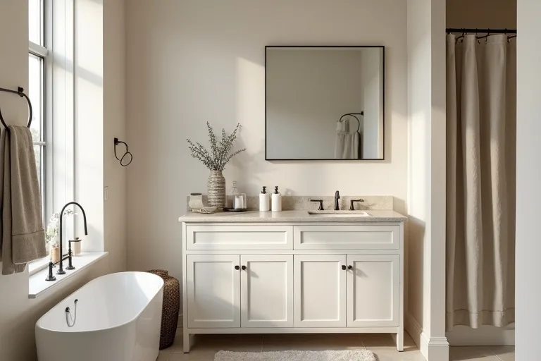
If a bathroom feels restless, the paint color is often part of the problem. Harsh white, cool gray, or a shade that fights the tile can make even a clean room feel unsettled.
The calmer choice is usually not more color, but better color: something soft, balanced, and easy to live with alongside the fixtures, light, and finishes already in the room.
Soft neutrals, muted whites, and gentle greige tones usually make a bathroom feel calmer and more cohesive. The best choice is the one that works with your light, tile, and fixtures without creating a sharp contrast that makes the room feel busier than it needs to be.
Choose a color family that supports the room
For most bathrooms, the most useful paint colors are the ones that create a steady background rather than a strong focal point. That is why soft neutral families tend to work so well. They reduce visual noise and help the room feel connected, especially when the vanity, mirror, tile, and shower curtain already bring in different materials.
Warm whites can make a bathroom feel cleaner without looking stark. Pale beige and sand tones add softness when the room gets cool light. Greige sits between warm and cool, which often makes it one of the easiest options when you want calm without the flatness that can come from a plain builder beige.
Muted blue-gray or green-gray can also work if you want a little more character while still keeping the room quiet. The key is to keep the saturation low. Bathrooms usually benefit from colors that recede a little instead of competing with every reflective surface in the room.
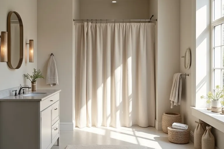
Before you narrow the palette, ask one simple question: do you want the bathroom to feel lighter, warmer, or more connected to the existing tile? That answer is often more useful than chasing a trendy color name.
Match paint to light, tile, and fixtures
A bathroom color rarely succeeds on its own. It has to sit beside what is already fixed in the room, especially tile, countertop surfaces, faucets, and the amount of natural light. A warm color in a north-facing room may feel balanced, while the same color in bright afternoon sun can lean too yellow.
It helps to look at the room in three parts:
- Light: Observe the wall at different times of day before you commit.
- Fixed finishes: Check whether the tile and fixtures lean warm, cool, or mixed.
- Soft elements: Bring in towels, curtains, and bath mats that support the wall color instead of fighting it.
If the tile is busy, a quieter wall color often calms the room immediately. If the fixtures are simple, you may have a little more freedom to choose a slightly richer neutral. And if the room has very little natural light, lighter mid-tones usually work better than stark white because they feel softer without turning cold.
Use simple rules for small or awkward bathrooms
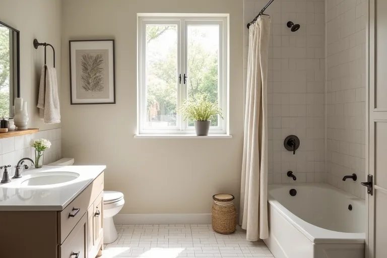
Small bathrooms do not need dramatic paint colors to feel interesting. In fact, bold contrast can make them feel tighter and more fragmented. A calmer palette usually works better because it lets the room read as one continuous space.
These simple rules help:
Keep contrast low when the room is busy. If your bathroom has patterned tile, multiple finishes, or a lot of visual interruption, choose a wall color that softens the whole picture.
Use one clear undertone. Mixing a cool wall paint with warm tile or wood can create a subtle clash that you keep noticing, even if you cannot immediately name it.
Choose lighter mid-tones for low light. A very dark shade can feel heavy in a room with no strong daylight, while a pale tone can help the room feel more open.
Let the trim do less. In a compact bathroom, you usually do not need sharp trim contrast unless you are intentionally going for a stronger style.
A soft neutral is often the easiest answer, but not because it is boring. It works because it gives the eye a place to rest. In a room that already has mirrors, plumbing, tiles, and glass, that matters more than most people expect.
Add texture so the room feels finished
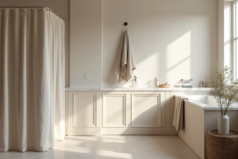
A calm bathroom should not feel empty. Once the wall color is right, texture is what keeps the room from looking flat. A neutral palette becomes more inviting when it has a few soft materials to offset all the harder surfaces in the room.
A fabric shower curtain is one of the simplest ways to do that. It softens the visual line of the shower area and gives the room a more relaxed, finished look. Towels with a little texture, a woven hamper, or a simple bath mat can do the same job without adding clutter.
If the bathroom storage is visible, keep it tidy and restrained. An over toilet storage shelf bathroom can help if you need space, but it works best when the items on it are limited and visually quiet. That is especially important in a small room where every surface is visible at once.
When you want a quick refresh without changing every finish, focus on the wall color first and then support it with one or two soft accessories. That usually creates a calmer result than trying to solve the room with decor alone.
Best next step
Before you buy paint, estimate how much you actually need and make sure the color choice fits the rest of the room plan. The paint calculator is the quickest way to get that part clear, and the design styles hub can help you keep the bathroom aligned with a broader look. If you are planning a fuller refresh, the paint calculator tool is a useful place to start before shopping for materials.
- Choosing a color from a sample card without checking it beside your tile and fixtures.
- Picking a bright white that looks clean in theory but feels harsh in the actual bathroom light.
- Using too many competing finishes, which makes the room feel busier than the paint can fix.
- Ignoring undertones, especially when the tile, vanity, and wall paint are not in the same temperature family.
- Adding strong decor before the main color decision is settled.
The calmest bathroom paint colors are usually soft neutrals, muted whites, and gentle greige tones. They work because they support the room instead of competing with it. If you match the color to the light, the tile, and the fixtures, then finish with a little soft texture, the whole bathroom feels more connected and easier to live with.
Helpful next tools and planners
If you want to make the decision easier before you buy
A few practical tools can help you move from color ideas to a real plan, especially if you are trying to keep the refresh calm, simple, and within budget.
FAQ
What bathroom paint colors feel the calmest?
Soft neutrals, muted whites, and gentle greige shades usually feel the calmest because they reduce visual noise and work well with most bathroom finishes.
Is white a good bathroom color?
Yes, but the best version is often a softened white rather than a bright, stark one. A slightly warmer white usually feels less harsh in a bathroom.
What if my bathroom has warm tile and cool fixtures?
Choose a paint color with a balanced undertone, such as greige or a soft neutral, so the walls help bridge the difference instead of emphasizing it.
How do I make a small bathroom feel more cohesive?
Keep the wall color quiet, limit strong contrast, and use a few soft-textured accessories so the room feels connected rather than chopped into separate pieces.
Three sensible next steps
Some links in this article may be affiliate links. Read more in the Affiliate Disclosure.