When they decide to decorate their living spaces, many people aim for an environment that feels balanced and pleasing to the eye. One way to achieve such harmony is by making use of analogous colors in design. These colors sit next to each other on the color wheel and when used together, they can create an atmosphere of tranquility and cohesiveness. By using this color scheme, homeowners can develop personalized and visually peaceful environments.
Understanding Analogous Colors
Analogous colors are groups of three colors that are adjacent to each other on the color wheel, sharing a common hue. For example, a common combination includes red, orange, and yellow. When used in design, these colors ensure that the space has a seamless flow because they usually match well and create serene environments.
The Science Behind Analogous Colors
Researchers indicate that color has a direct impact on human emotions and perceptions. According to a study by the University of Minnesota, color can affect mood and actions, influence thinking, change actions, and cause reactions. Furthermore, using similar colors can create unity, a sense of order, and visual harmony.
How to Use Analogous Colors in Home Design
When they approach home design, they can utilize analogous colors to create a calming and unified atmosphere. Here’s how:
| Step | Description |
|---|---|
| Select a Dominant Color | Choose one color to be the prominent shade in the room, which could be found in larger pieces like walls or furniture. |
| Choose Supporting Colors | Pick two to four colors next to the dominant color on the color wheel and use them in smaller elements like accents, decorations, and textiles. |
| Balance the Space | Ensure that the dominant color covers about 60% of the room, with 30% for secondary colors and 10% for accents. |
| Apply Neutrals | Incorporate neutral colors to prevent the space from becoming overwhelming, allowing the analogous colors to pop. |
Examples of Analogous Color Schemes
Exploring various analogous color schemes can inspire unique home designs:
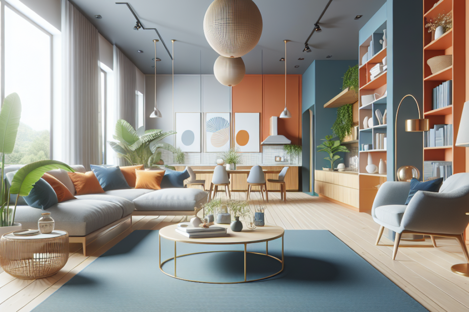
- Blue, Green, and Yellow: This combination can evoke nature, providing a fresh and vibrant feeling.
- Red, Orange, and Yellow: A warm, energetic palette reflecting sunlight and warmth.
- Violet, Blue, and Cyan: Offers a cool, serene environment reminiscent of the sea and sky.
Tips for Harmonious Designs with Analogous Colors
Here are some additional tips to ensure they get the most out of using analogous colors in their home designs:
- Start small: Test color combinations in smaller spaces or with accessories before committing to a full room.
- Consider room functionality: Use more vibrant analogous schemes in active spaces like the living room, and cooler schemes in restful spaces like bedrooms.
- Blend with textures and patterns: Adding textures and varied patterns can enhance the visual appeal without disrupting harmony.
- Observe natural lighting: Light can alter the appearance of colors, so consider how natural light interacts with the colors chosen.
Key Takeaways
- Analogous colors create a cohesive and harmonious environment by utilizing shades adjacent on the color wheel.
- The 60-30-10 rule is essential for balancing dominant, secondary, and accent colors.
- Experimentation and consideration of the room’s purpose and lighting can enhance the effect of analogous color schemes.
FAQs
- What are analogous colors?
- Analogous colors are groups of three colors located next to each other on the color wheel, often sharing a common hue.
- Why should I use analogous colors in home design?
- They create a harmonious and visually pleasing space by maintaining unity and balance in color schemes.
- How do I choose a dominant color?
- Choose a color that you love and think suits the purpose and mood of the room, then select adjacent colors on the color wheel.
- Can I use more than three colors?
- While three colors are common, incorporating more than three can work as long as the balance is maintained, using the 60-30-10 rule.
- How can I avoid overwhelming the space?
- Introduce neutral shades, textures, and patterns to prevent the color scheme from appearing too intense.